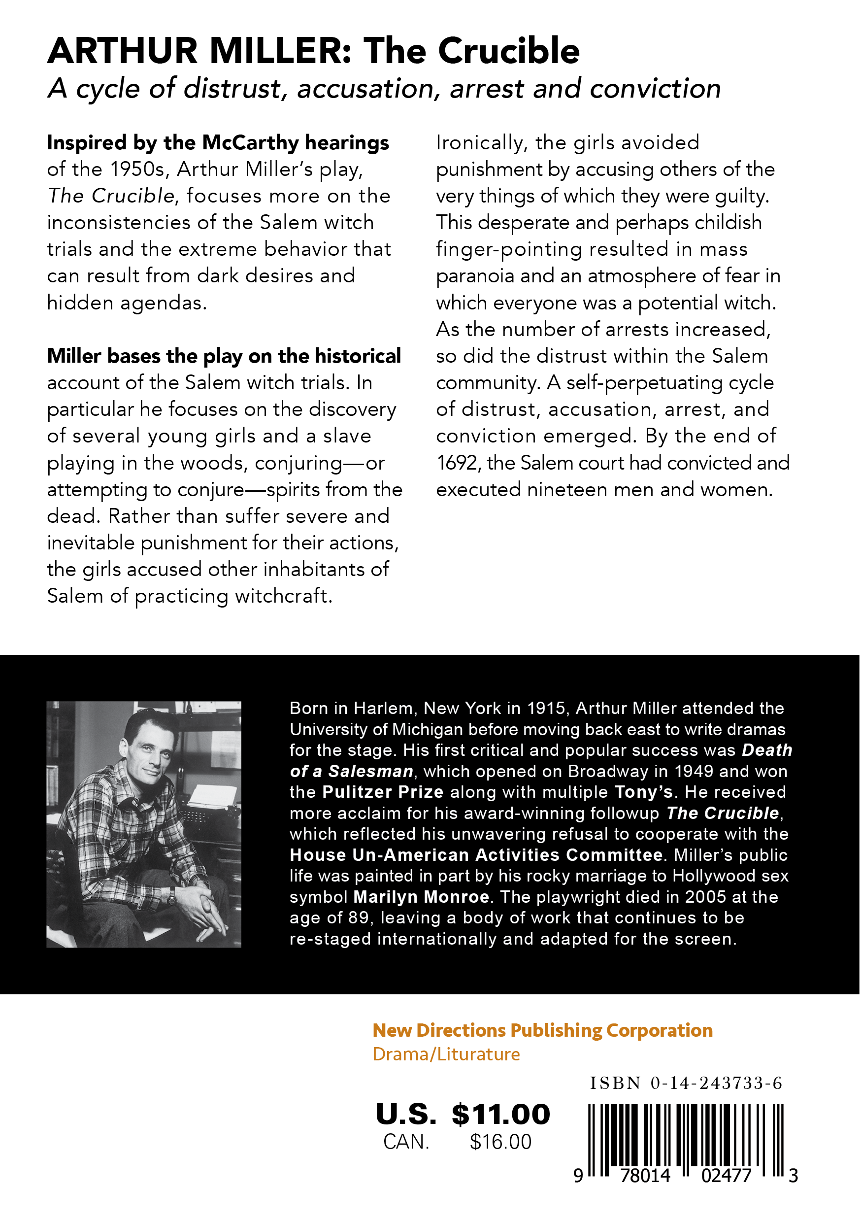
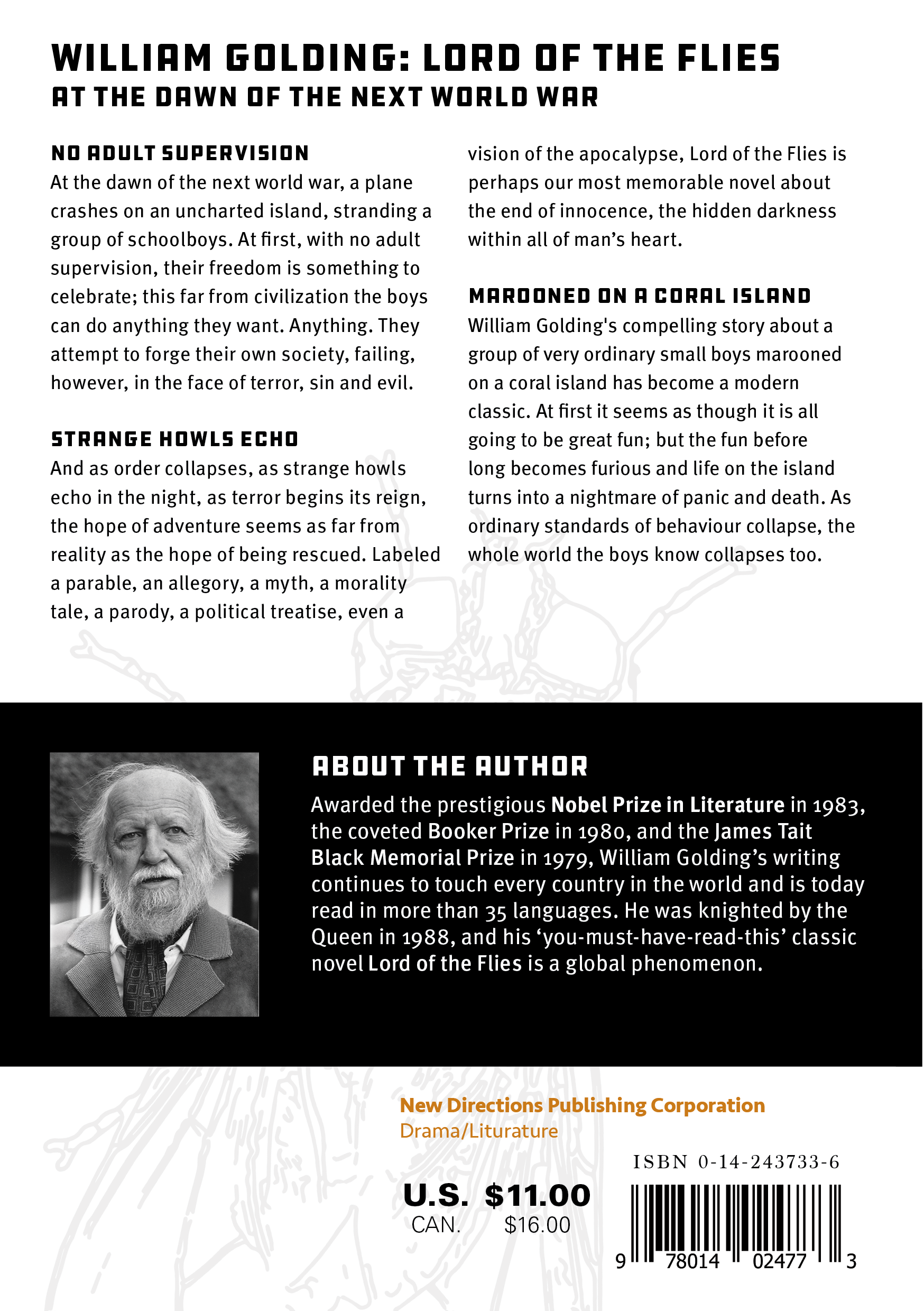
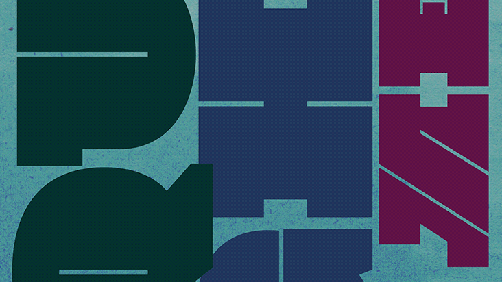
Contemporary publishing relies on strong visual storytelling to help readers navigate genre, tone, and theme at a glance. This project repositions two classic works—The Crucible and Lord of the Flies—for new audiences by designing a refreshed cover system for New Directions Publishing Corporation, using typography as the primary narrative device supported by vector illustration.
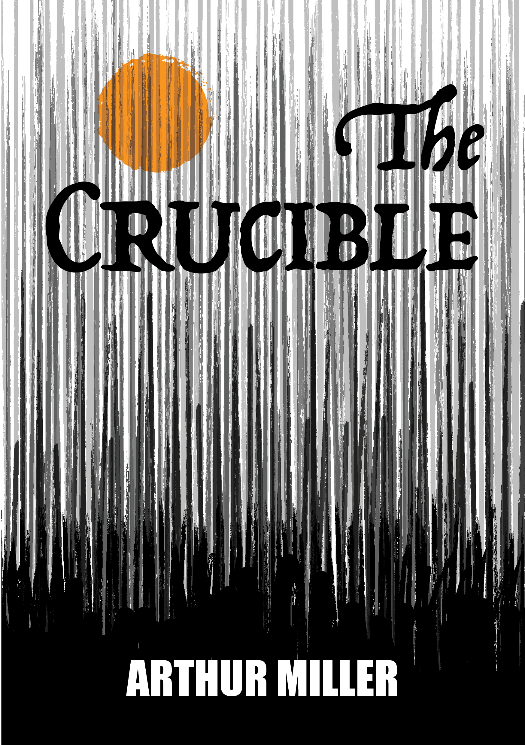
Each cover explores contrast, hierarchy, and pacing to translate content into form: The Crucible uses weight, texture, and a restrained accent color to signal paranoia and moral pressure, while Lord of the Flies uses open space and a swarm-like illustrative field to communicate isolation and escalating disorder.
The outcome is a cohesive pair of contemporary covers with clear shelf presence, consistent brand structure, and production-ready front, spine, and back layouts presented through print mockups.