I designed the logotype for Hiker Hobble, a long-distance hiking podcast, as a study in typographic voice, structural consistency, and vector-based letterform construction. The goal was to produce a wordmark with a durable, “weighted” character—visually aligned with endurance and trail culture—while maintaining clarity across small digital sizes and large-format promotional use.
The letterforms were developed through iterative vector refinement, using controlled stroke weight, compressed counters, and minimal contrast between thick and thin strokes to sustain tonal consistency across the set. A tall x-height supports legibility, while subtle diagonal relationships and calibrated terminal transitions introduce movement without weakening the underlying geometry. Spacing and internal counterforms were adjusted through repeated proofing to stabilize rhythm, align optical balance, and preserve coherence between Hiker and Hobble as a unified mark.
Methods: Designed and produced in Glyphs, with iterative outline correction, spacing proofing, and optical adjustments to stroke modulation and terminal structure.
Process artifacts document anchor-point structure, proportional decisions, and scale testing, demonstrating how formal typographic constraints can be used to generate a distinctive brand voice.
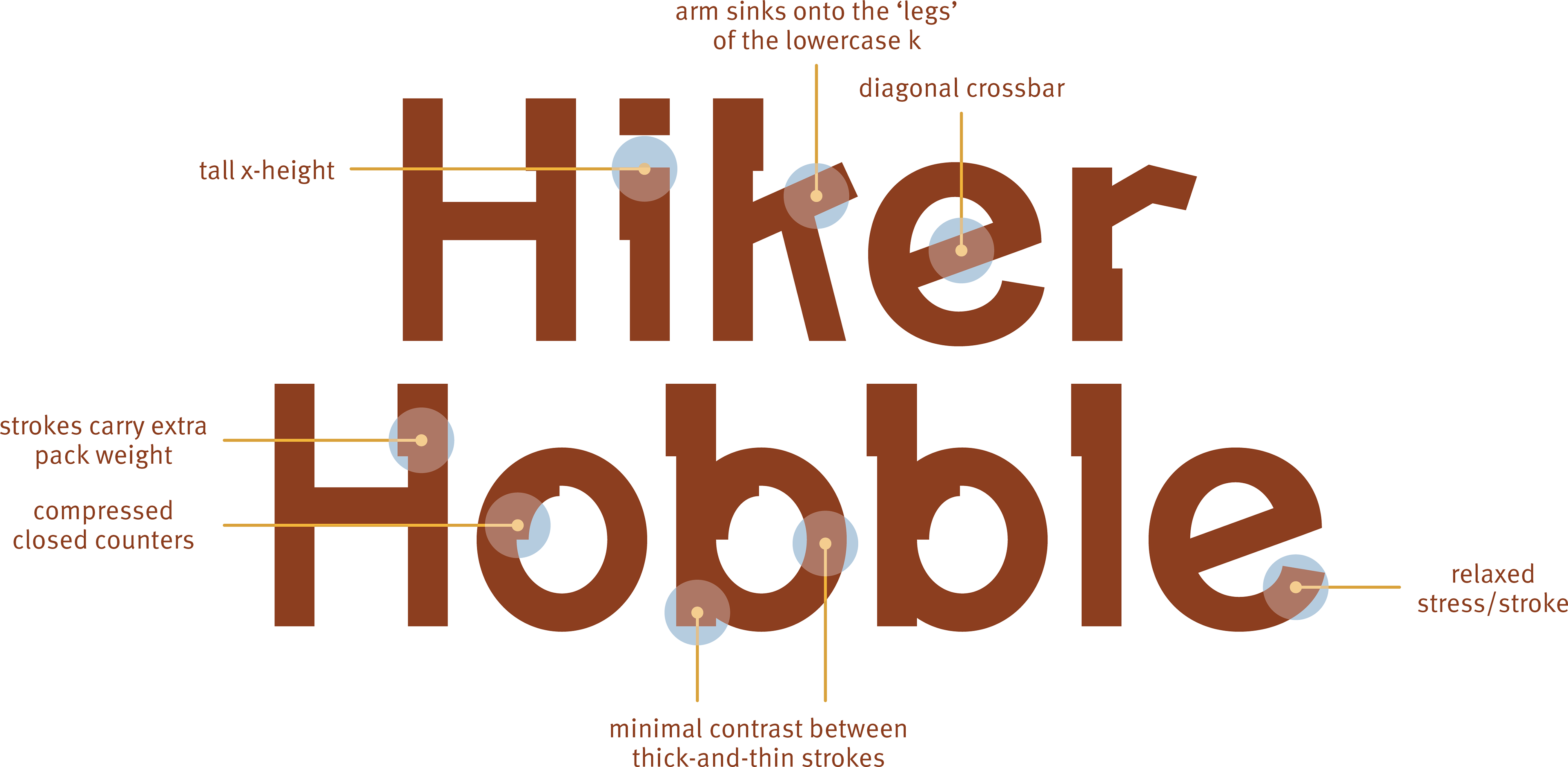
Annotated analysis of key formal attributes—including tall x-height, compressed counters, minimal stroke contrast, and diagonal relationships—used to define the mark’s rugged, stable character.
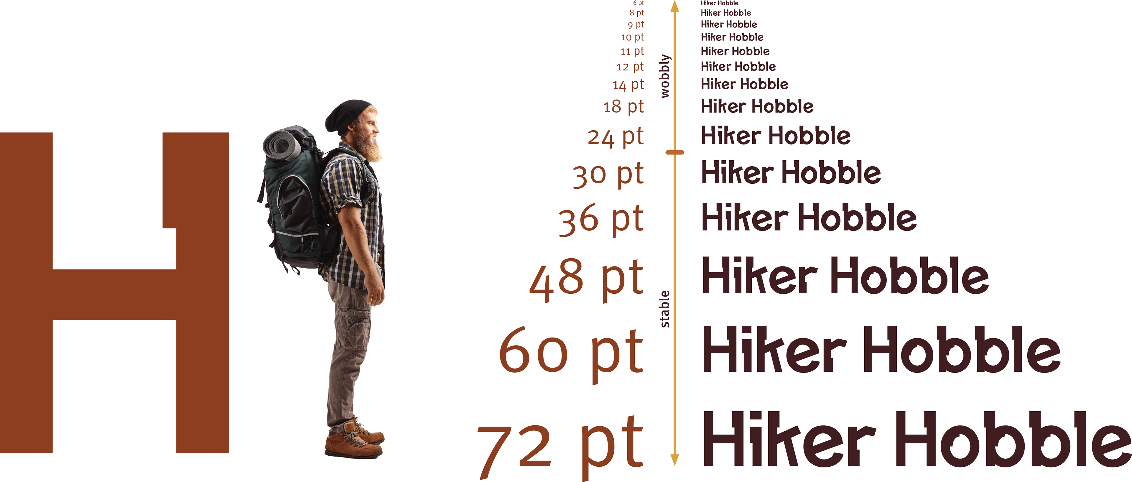
Scale proof evaluating the logotype across point sizes, testing stroke density, counter compression, and clarity for small digital use through larger promotional applications.
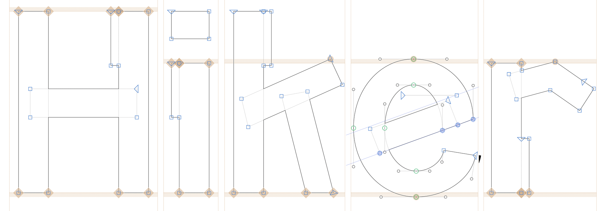
Vector construction outline for Hiker, showing anchor points, Bézier handles, and alignment logic used to establish proportions, stroke relationships, and counter structure.
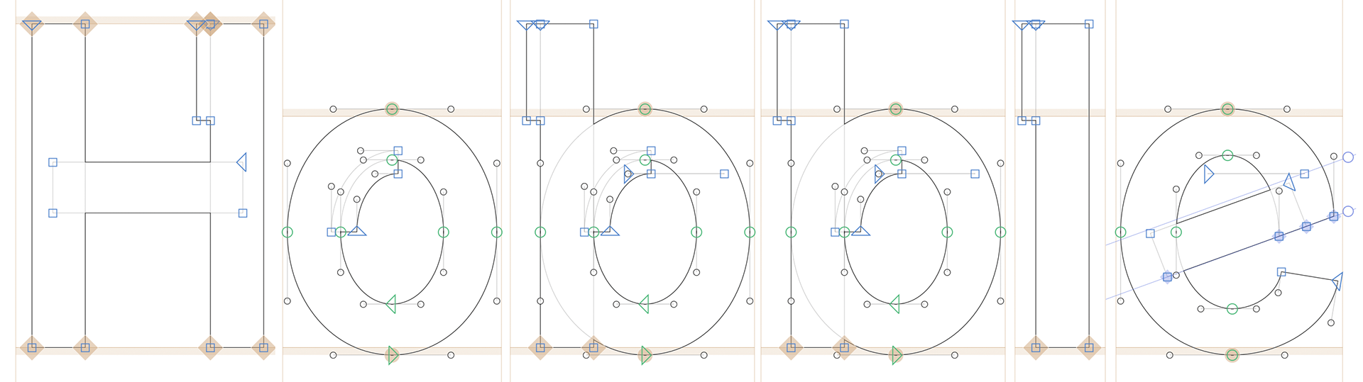
Vector construction outline for Hobble, documenting iterative adjustments to stems, bowls, terminals, and spacing to maintain rhythm and structural consistency with Hiker.