Kent State University • Typography I
Typographic System—Theatre Season Poster
PROJECT OVERVIEW
This assignment focused on building a purely typographic poster system for a theatre season at the Kent State University School of Theatre and Dance. Students analyzed the season’s content to determine hierarchy, levels of information, and logical groupings, then translated that structure into a clear typographic communication system.
This assignment focused on building a purely typographic poster system for a theatre season at the Kent State University School of Theatre and Dance. Students analyzed the season’s content to determine hierarchy, levels of information, and logical groupings, then translated that structure into a clear typographic communication system.
METHOD / PROCESS
Students audited the provided information to define primary, secondary, and tertiary content and to establish consistent groupings across the season. Designs explored macro-typography (overall structure, scale, and pacing) alongside micro-typography (spacing, alignment, leading, tracking, and typographic details) to improve clarity and readability. The final poster emphasized typographic hierarchy and system consistency, using only type with optional supporting devices such as rules, shapes, bullets, and knocked-out text.
Students audited the provided information to define primary, secondary, and tertiary content and to establish consistent groupings across the season. Designs explored macro-typography (overall structure, scale, and pacing) alongside micro-typography (spacing, alignment, leading, tracking, and typographic details) to improve clarity and readability. The final poster emphasized typographic hierarchy and system consistency, using only type with optional supporting devices such as rules, shapes, bullets, and knocked-out text.
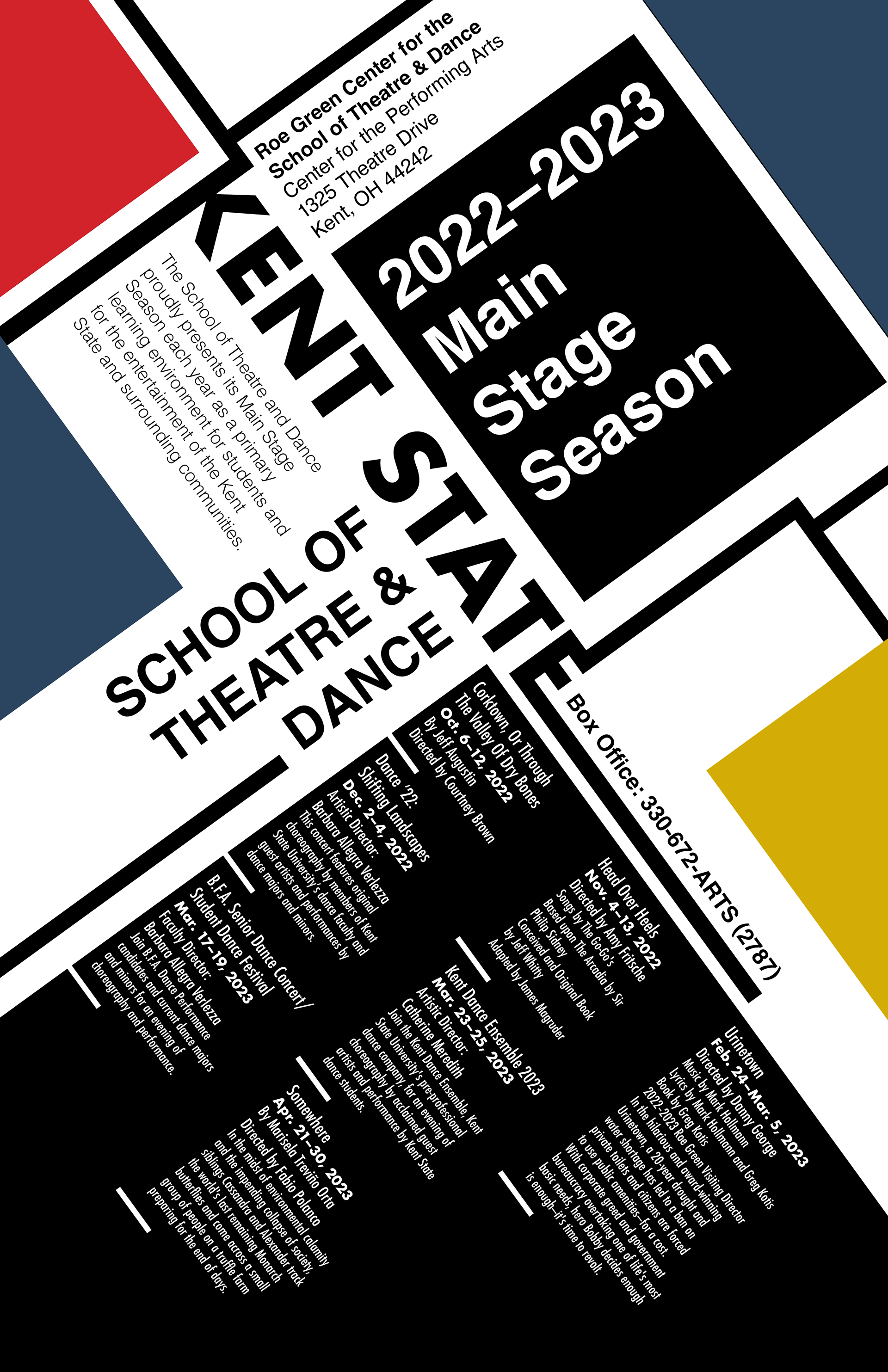
Typographic season poster: Purely typographic system paying homage to Swiss/International Typographic Style (with Bauhaus influence), using bold scale shifts, modular blocks, and high-contrast fields to establish hierarchy across season, venue, and event details. Rotated type and rule-based dividers create a dynamic grid while maintaining clear information grouping and wayfinding.