Kent State University • Typography I
Sequential Typographic Design: Booklet
PROJECT OVERVIEW
This assignment introduced sequential typographic design through the creation of an eight-page booklet based on a design-related topic sourced from the AIGA website. Students developed a narrative structure in which typography, imagery, and written content work together to communicate a focused aspect of the chosen subject over time, rather than in a single-view composition.
This assignment introduced sequential typographic design through the creation of an eight-page booklet based on a design-related topic sourced from the AIGA website. Students developed a narrative structure in which typography, imagery, and written content work together to communicate a focused aspect of the chosen subject over time, rather than in a single-view composition.
METHOD / PROCESS
Students researched their topic to locate and curate supporting text and images, then organized the content into a paced reading experience across eight pages. Layout decisions emphasized hierarchy, continuity, and transitions between spreads—using typographic structure, image placement, and page-to-page rhythm to guide the reader through the story in a clear, intentional order.
Students researched their topic to locate and curate supporting text and images, then organized the content into a paced reading experience across eight pages. Layout decisions emphasized hierarchy, continuity, and transitions between spreads—using typographic structure, image placement, and page-to-page rhythm to guide the reader through the story in a clear, intentional order.
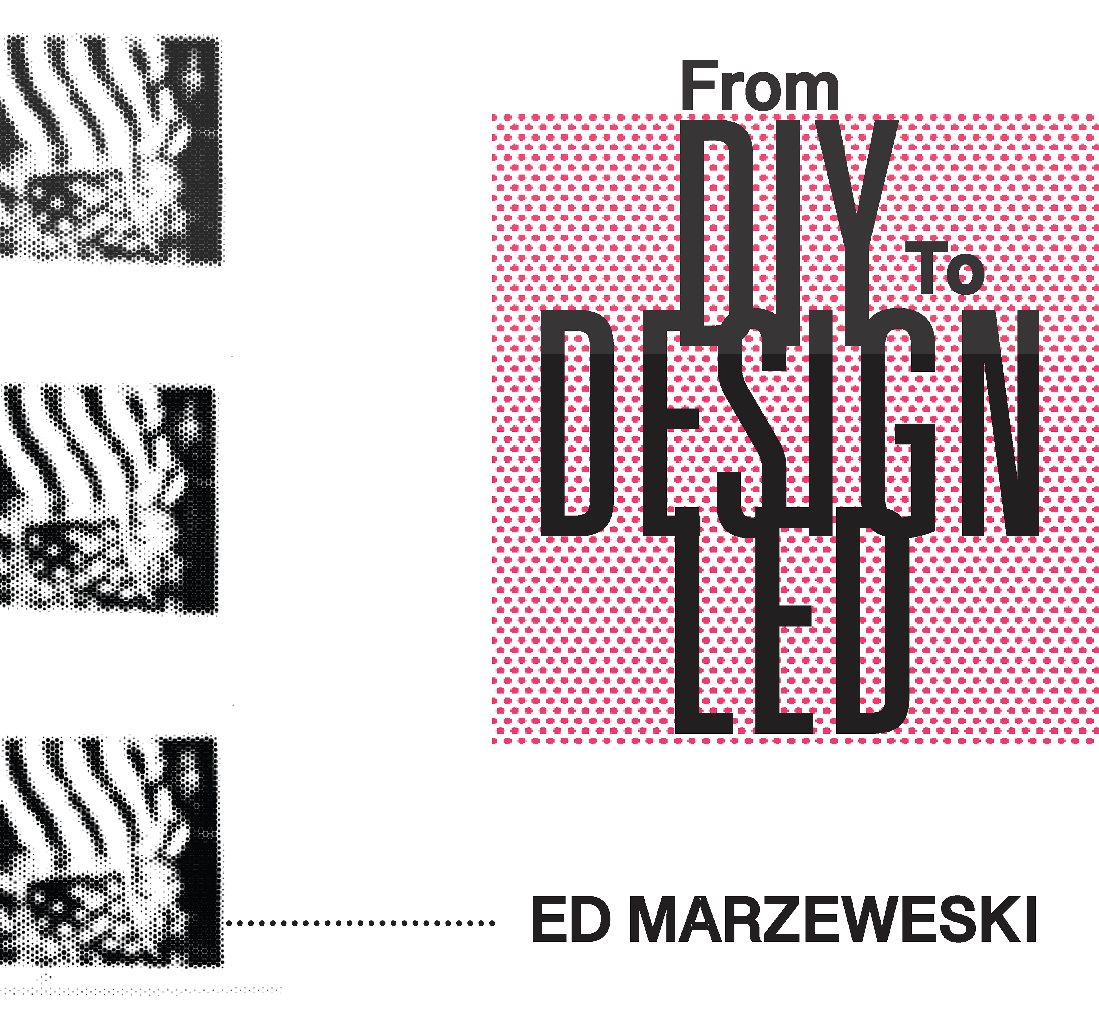
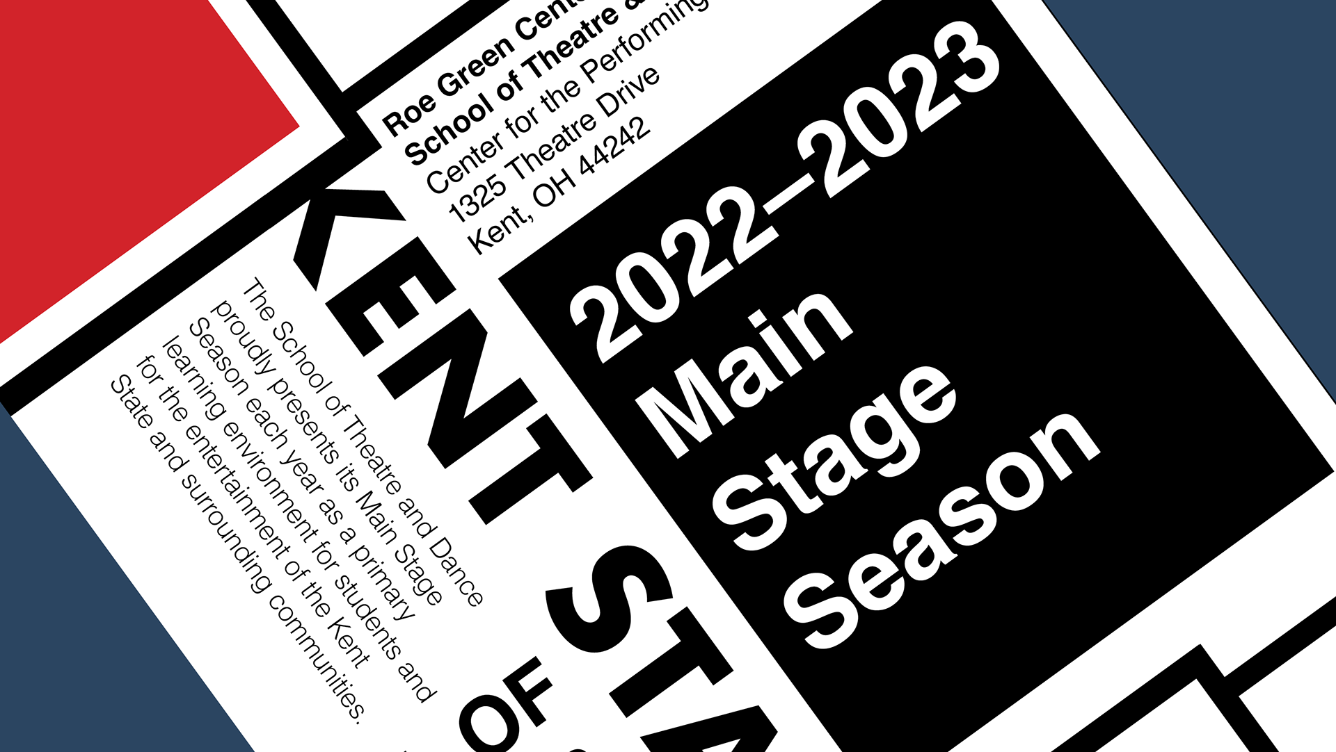
Cover: Condensed display typography stacks and overlaps to create a bold, poster-like title lockup, contrasted with halftone imagery and a hot-pink field for punchy figure/ground.
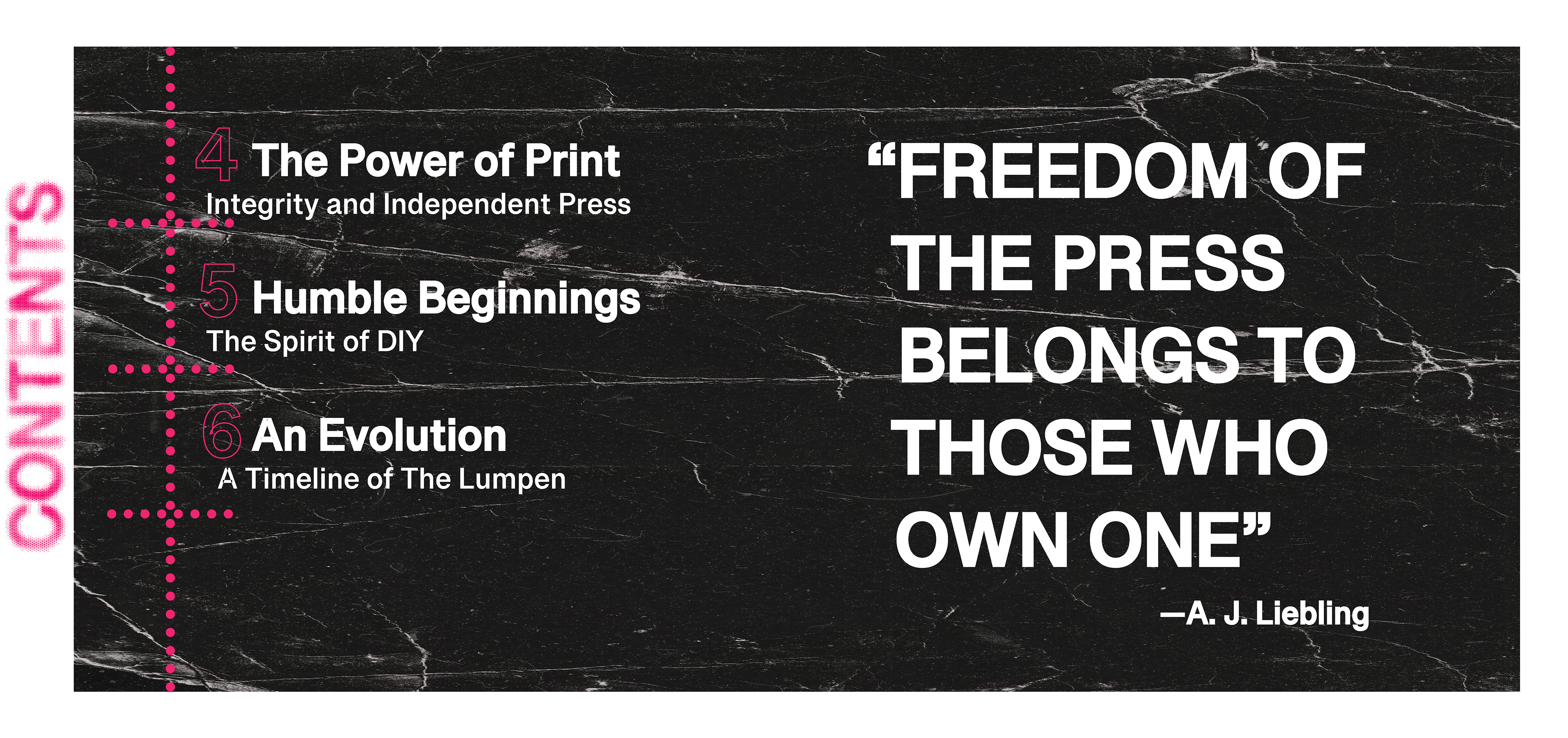
Spread 1: A high-contrast contents layout pairs a large pull-quote with a textured black image plate, using magenta dot leaders and rules to organize navigation and hierarchy.
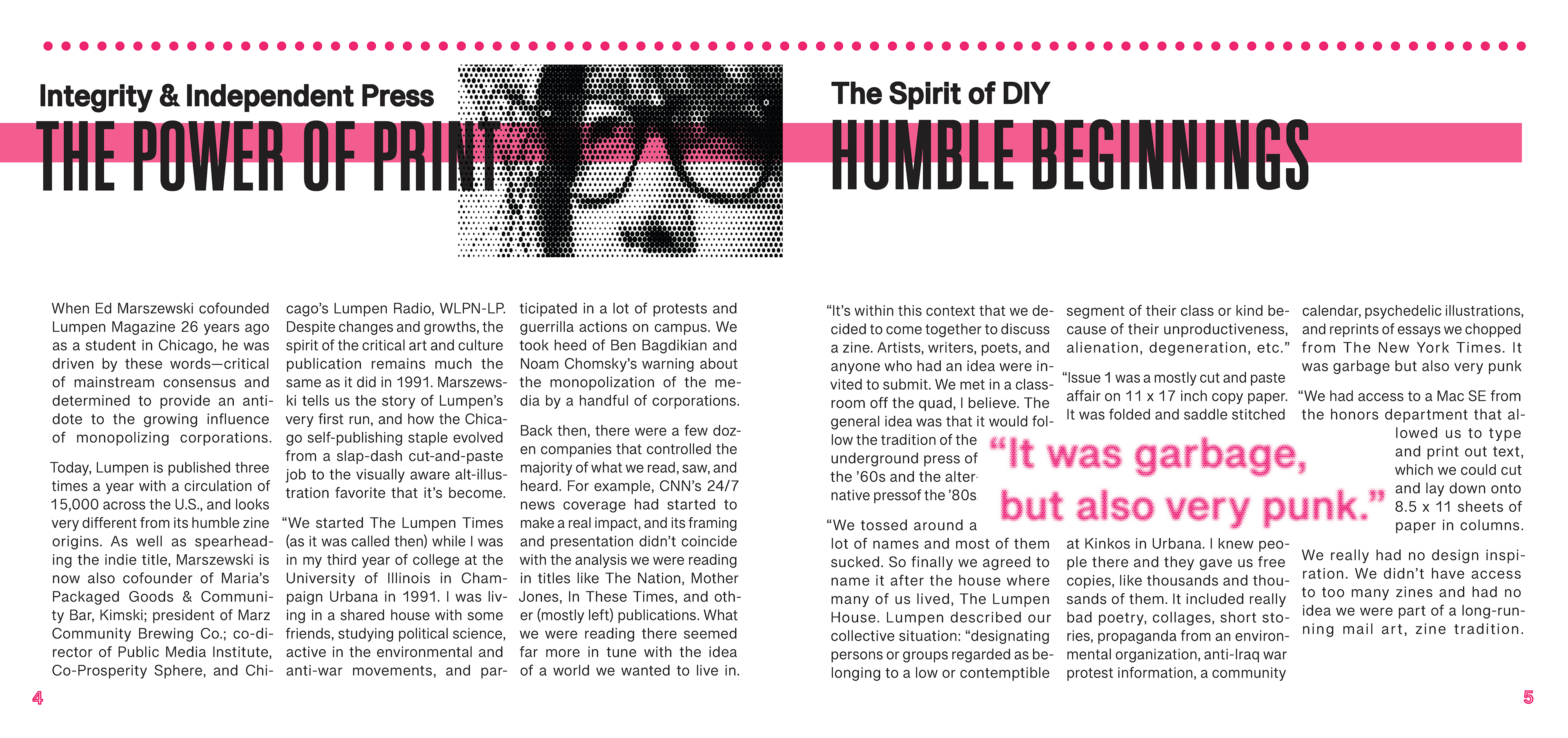
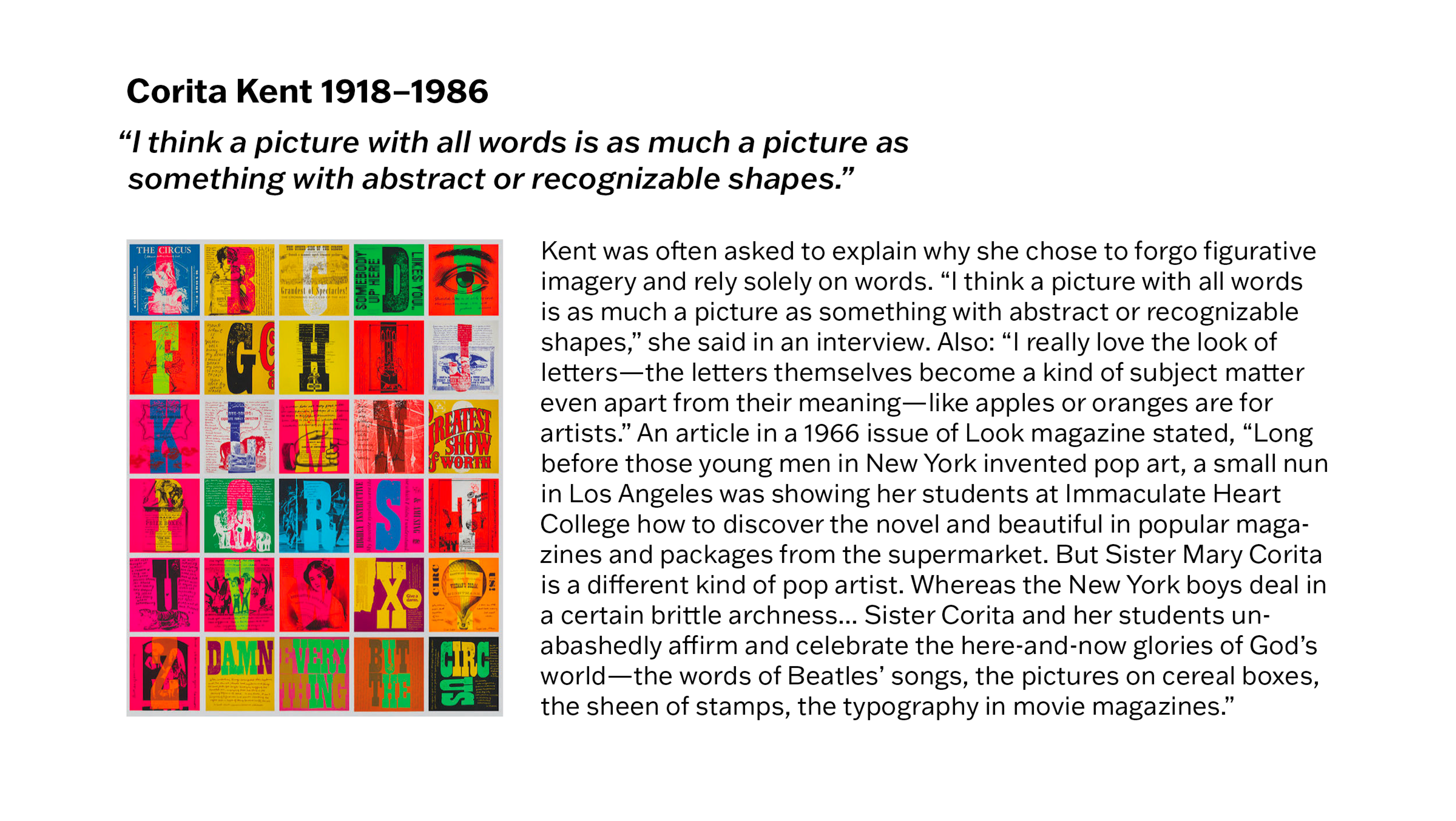
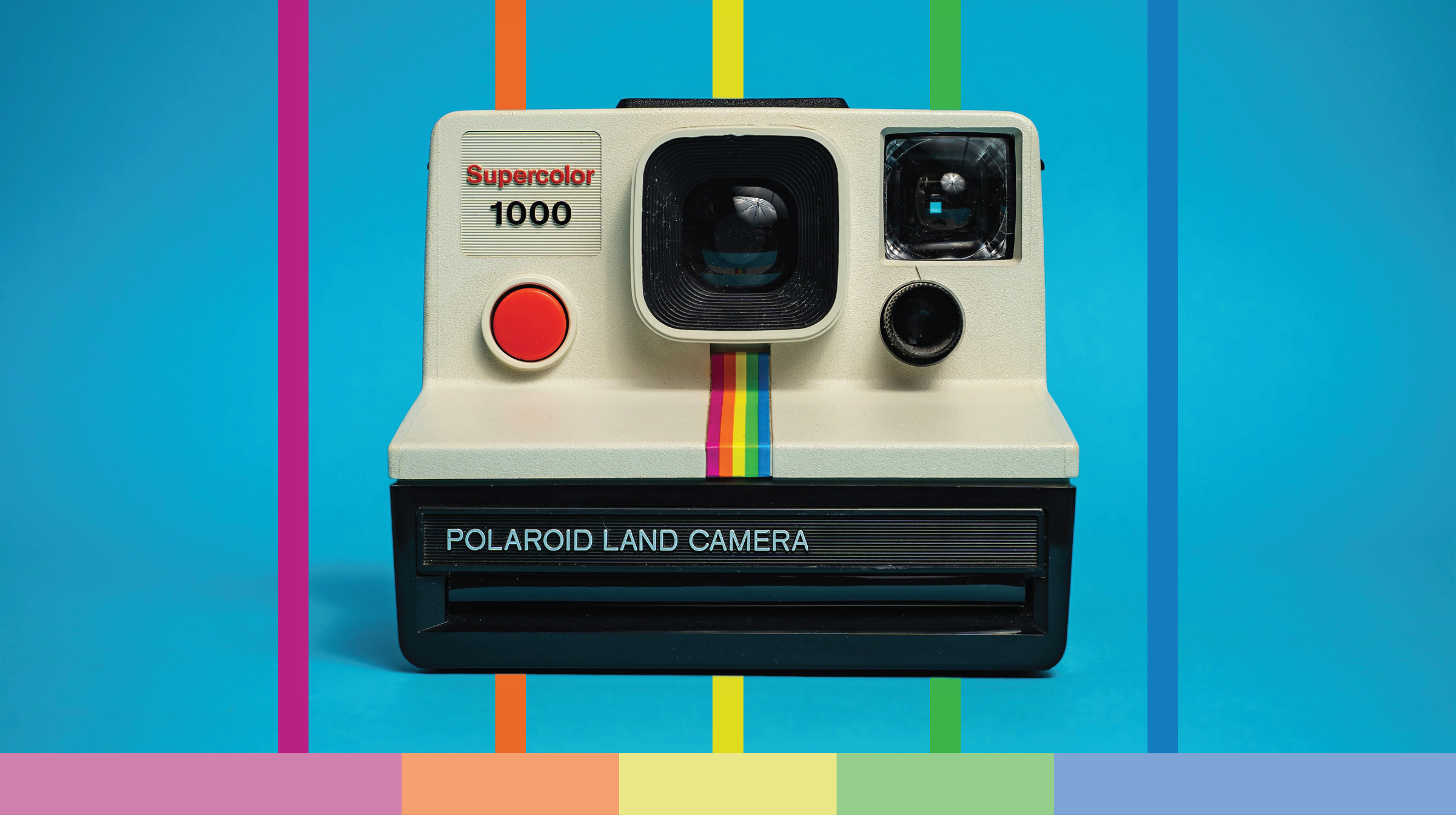
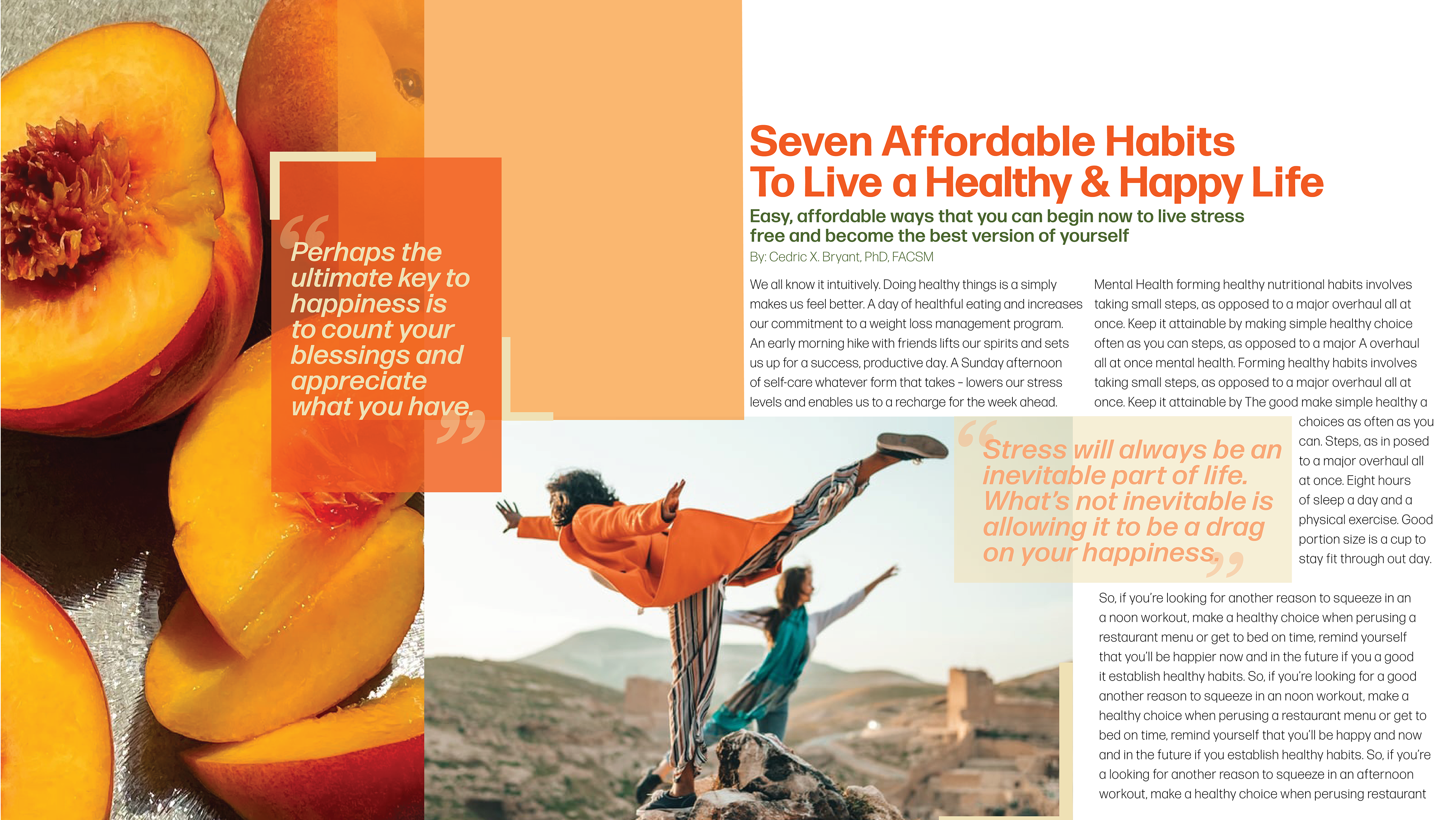
Spread 2: A structured two-page grid balances dense column text with a dominant headline band and halftone portrait, using color bars and repetition to unify the spread.
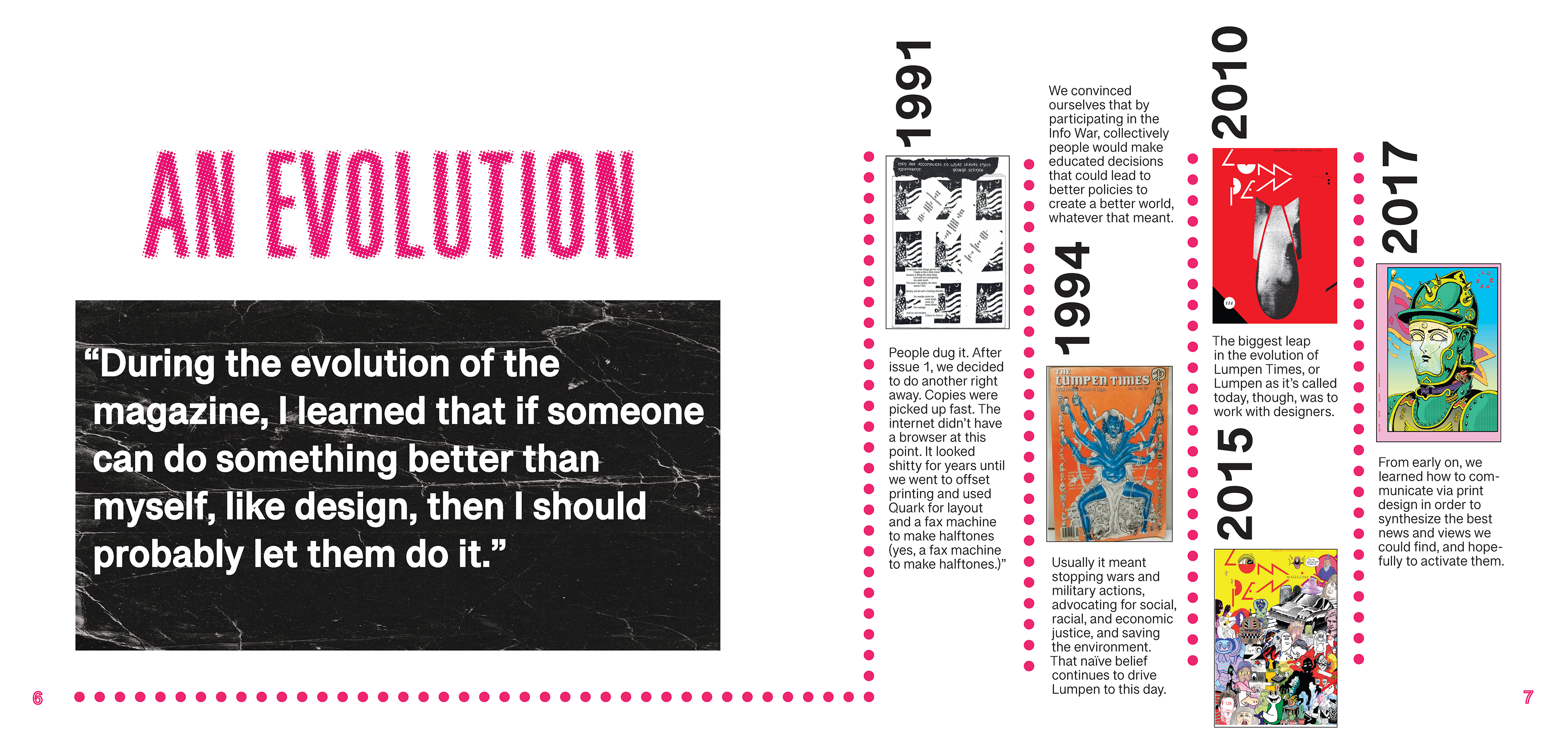
Spread 3: Overscaled typography and a quote block anchor the spread while a vertical timeline system and image inserts create rhythm, pacing, and clear chronological hierarchy.
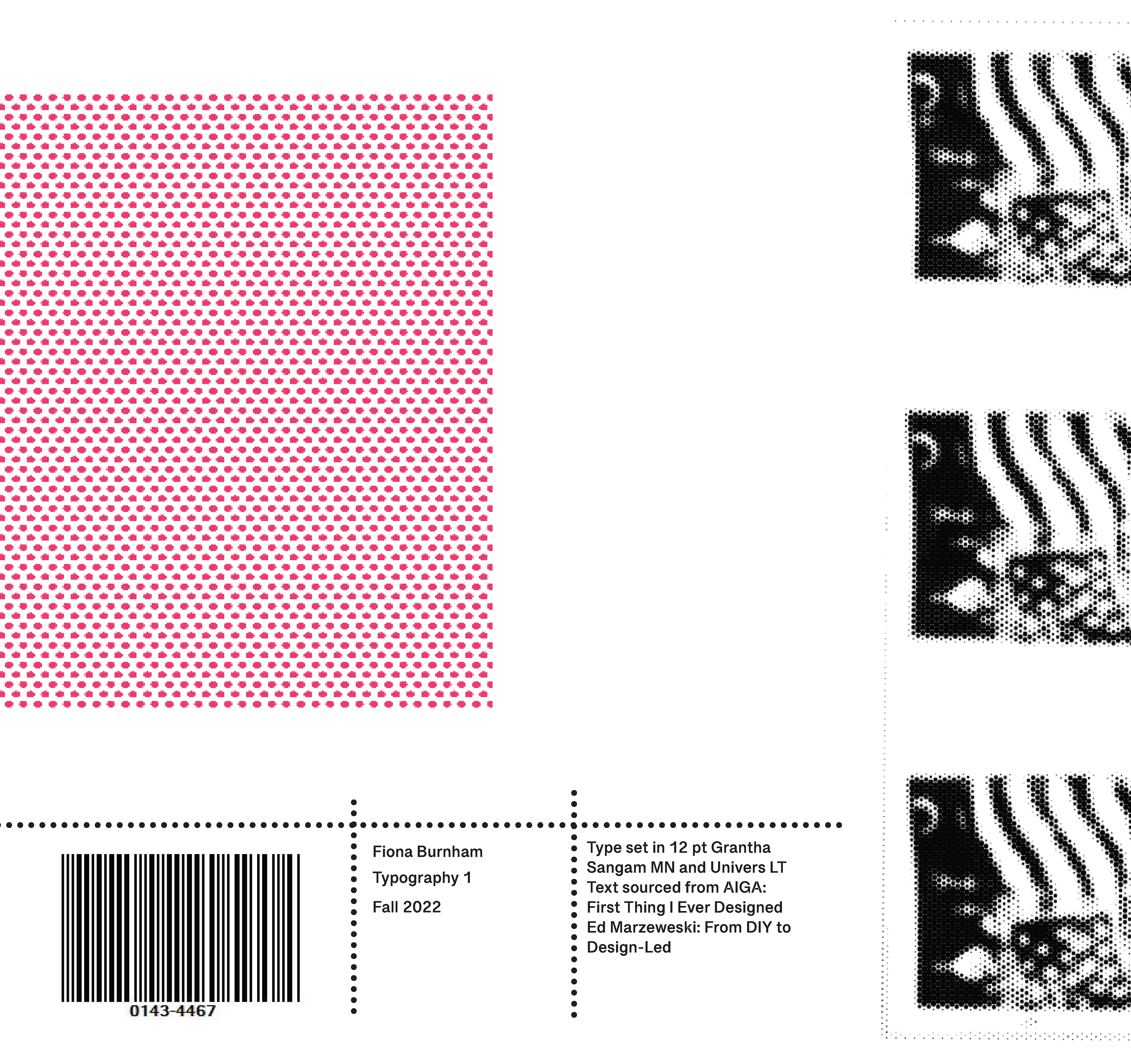
Back cover: A restrained colophon layout uses modular dot dividers, negative space, and repeated halftone tiles to frame credits and sourcing with a clean, editorial finish.