Kent State University • Typography I
Sequential Typographic Design: Booklet
PROJECT OVERVIEW
This assignment introduced sequential typographic design through the creation of an eight-page booklet based on a design-related topic sourced from the AIGA website. Students developed a narrative structure in which typography, imagery, and written content work together to communicate a focused aspect of the chosen subject over time, rather than in a single-view composition.
This assignment introduced sequential typographic design through the creation of an eight-page booklet based on a design-related topic sourced from the AIGA website. Students developed a narrative structure in which typography, imagery, and written content work together to communicate a focused aspect of the chosen subject over time, rather than in a single-view composition.
METHOD / PROCESS
Students researched their topic to locate and curate supporting text and images, then organized the content into a paced reading experience across eight pages. Layout decisions emphasized hierarchy, continuity, and transitions between spreads—using typographic structure, image placement, and page-to-page rhythm to guide the reader through the story in a clear, intentional order.
Students researched their topic to locate and curate supporting text and images, then organized the content into a paced reading experience across eight pages. Layout decisions emphasized hierarchy, continuity, and transitions between spreads—using typographic structure, image placement, and page-to-page rhythm to guide the reader through the story in a clear, intentional order.
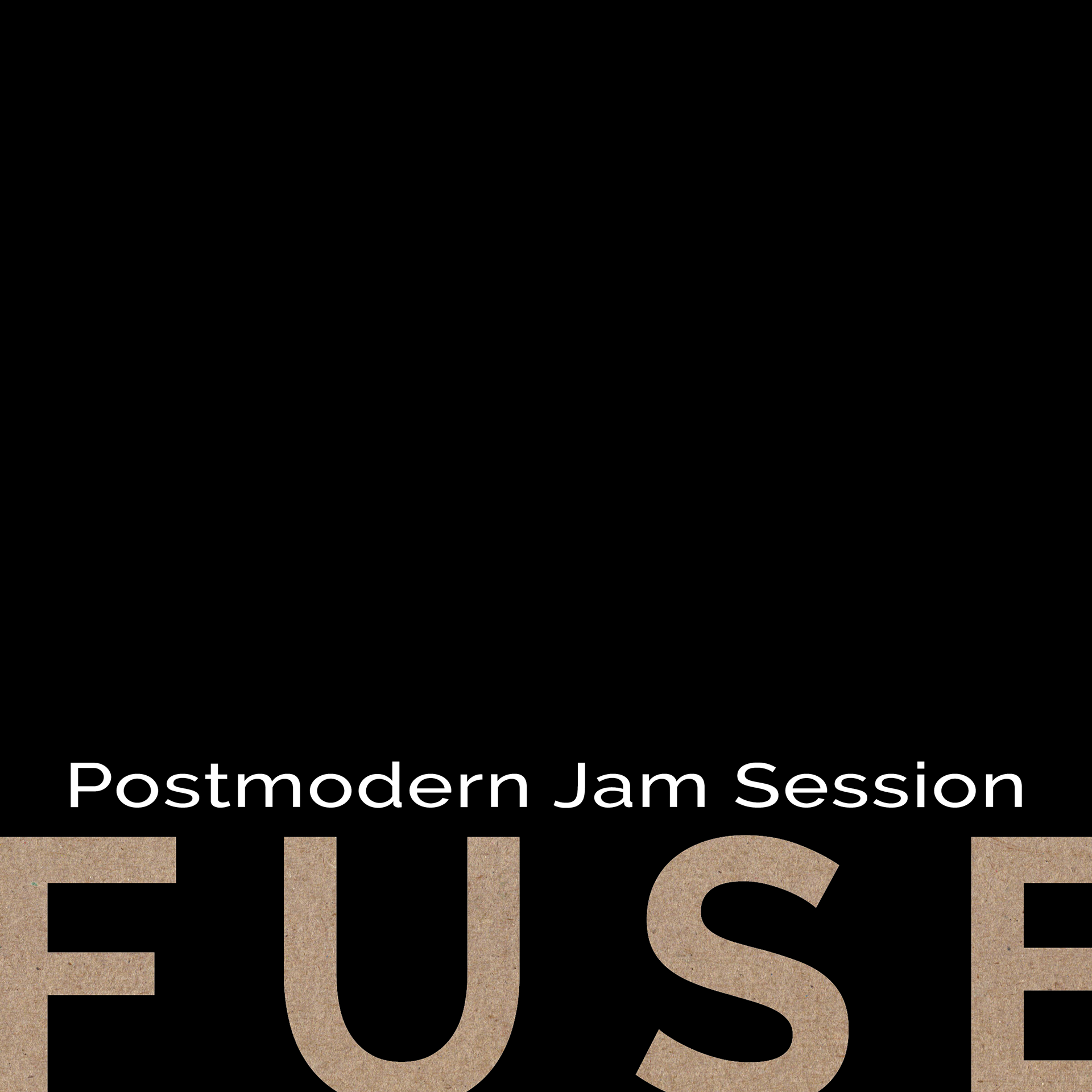
Cover: A restrained cover uses oversized type, stark negative space, and a tactile “FUSE” texture to establish hierarchy and set an editorial tone.
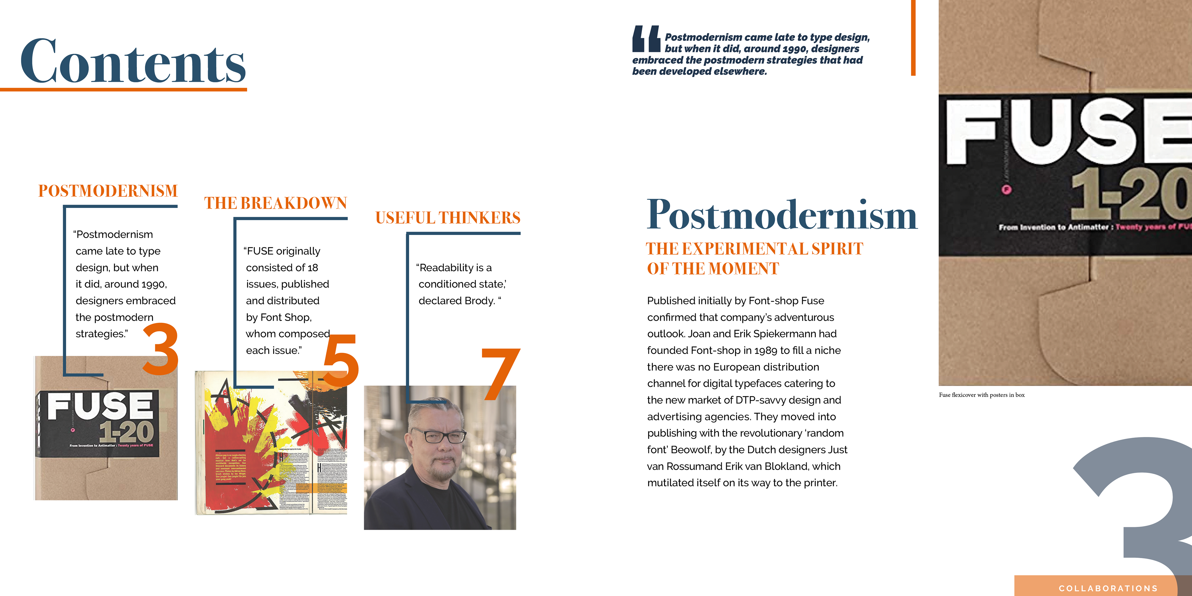
Spread 1: A modular contents structure pairs typographic blocks with anchored imagery, using scale contrast and rule lines to guide navigation and pacing.
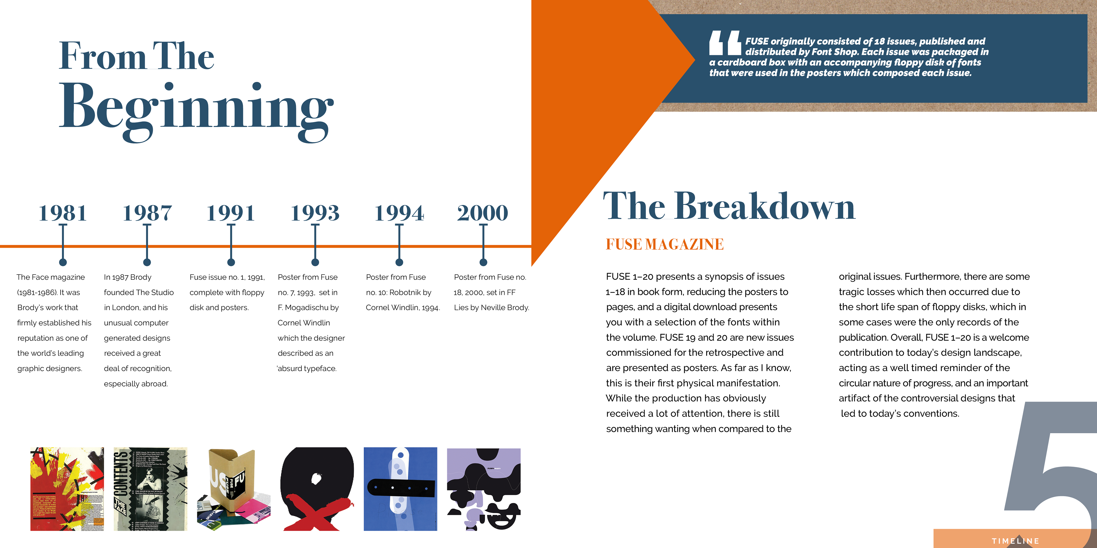
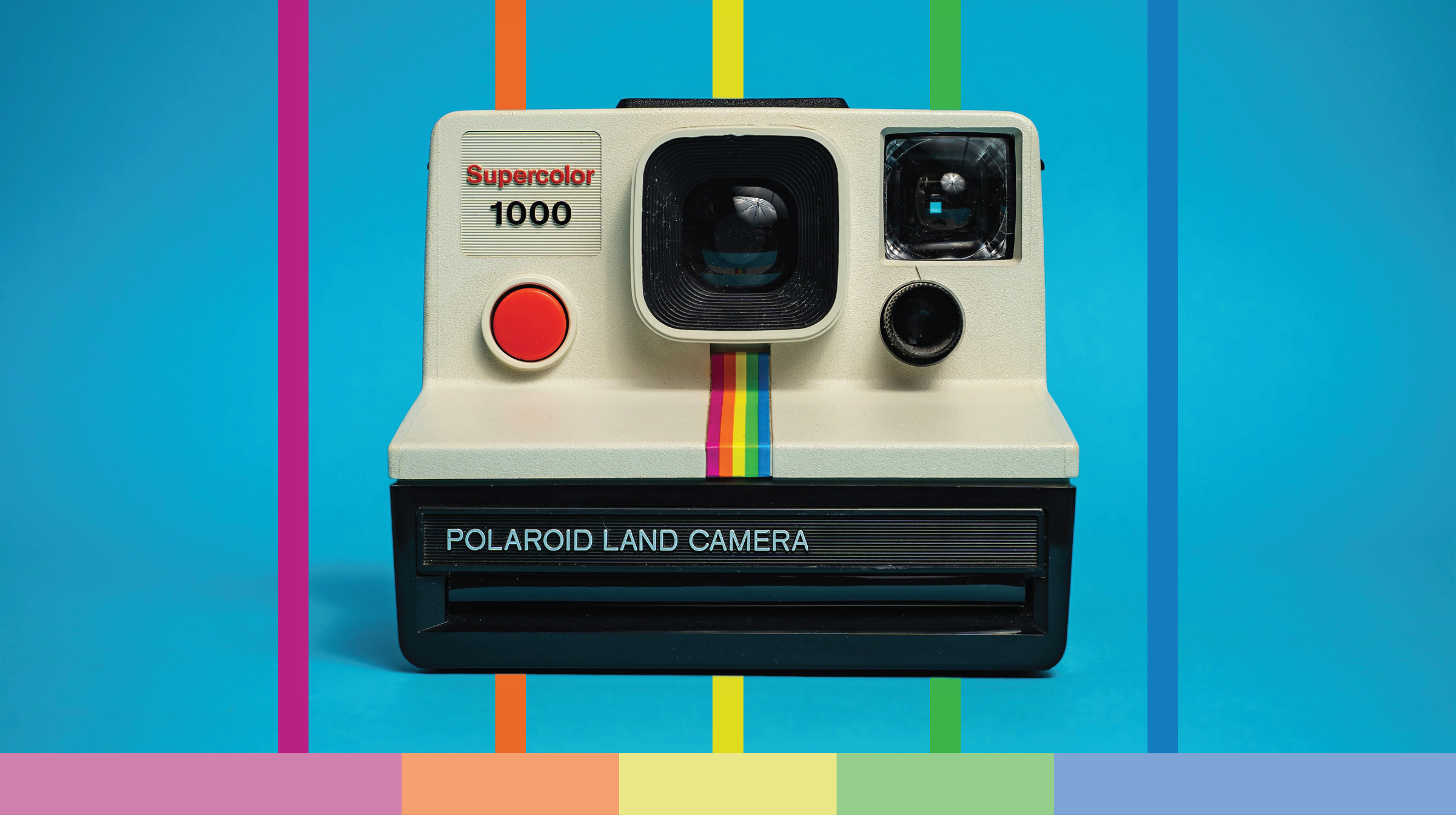
Spread 2: A timeline-driven spread organizes information through alignment and consistent typographic hierarchy, while bold geometric shapes create directional flow across the gutter.
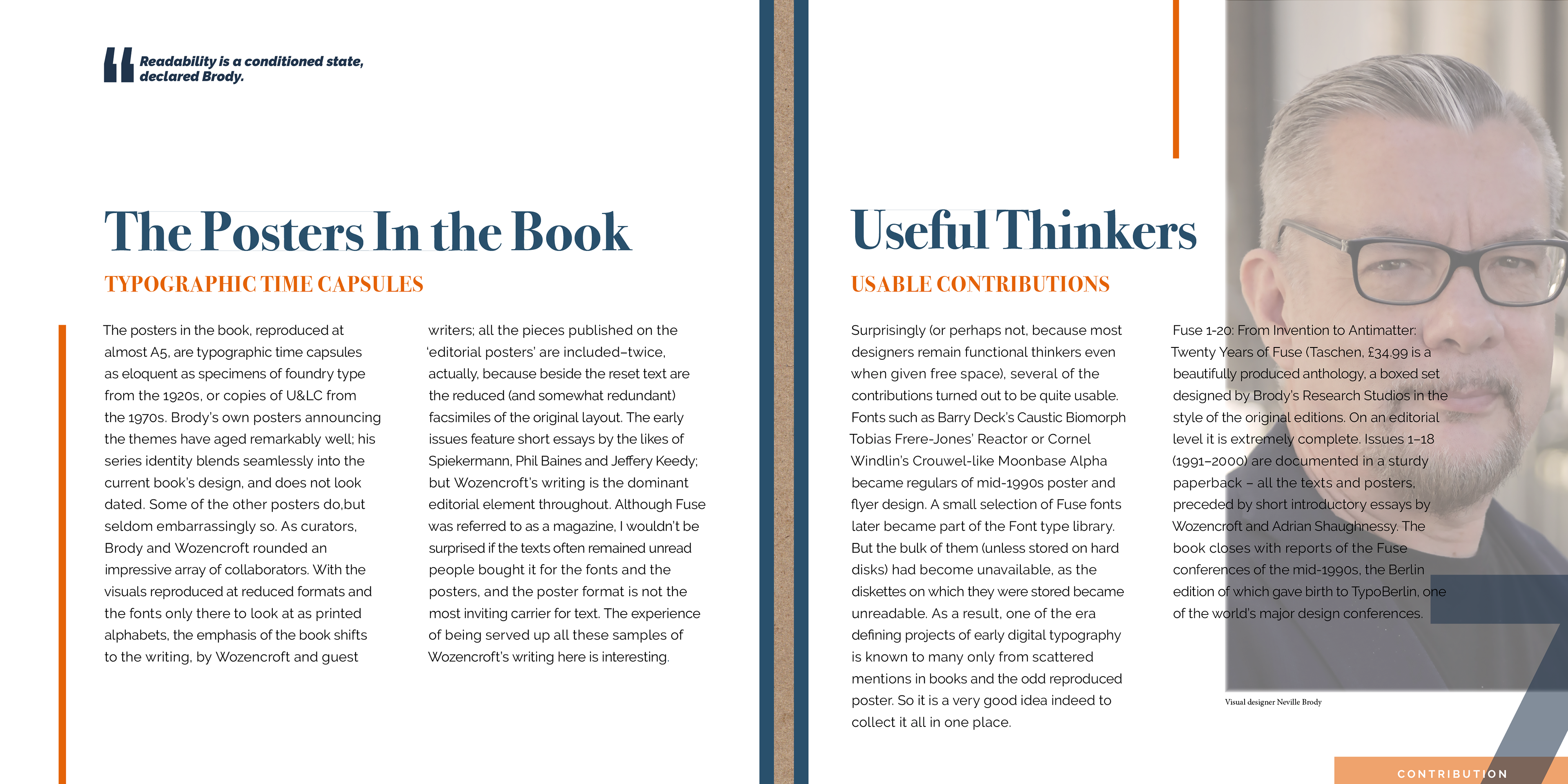
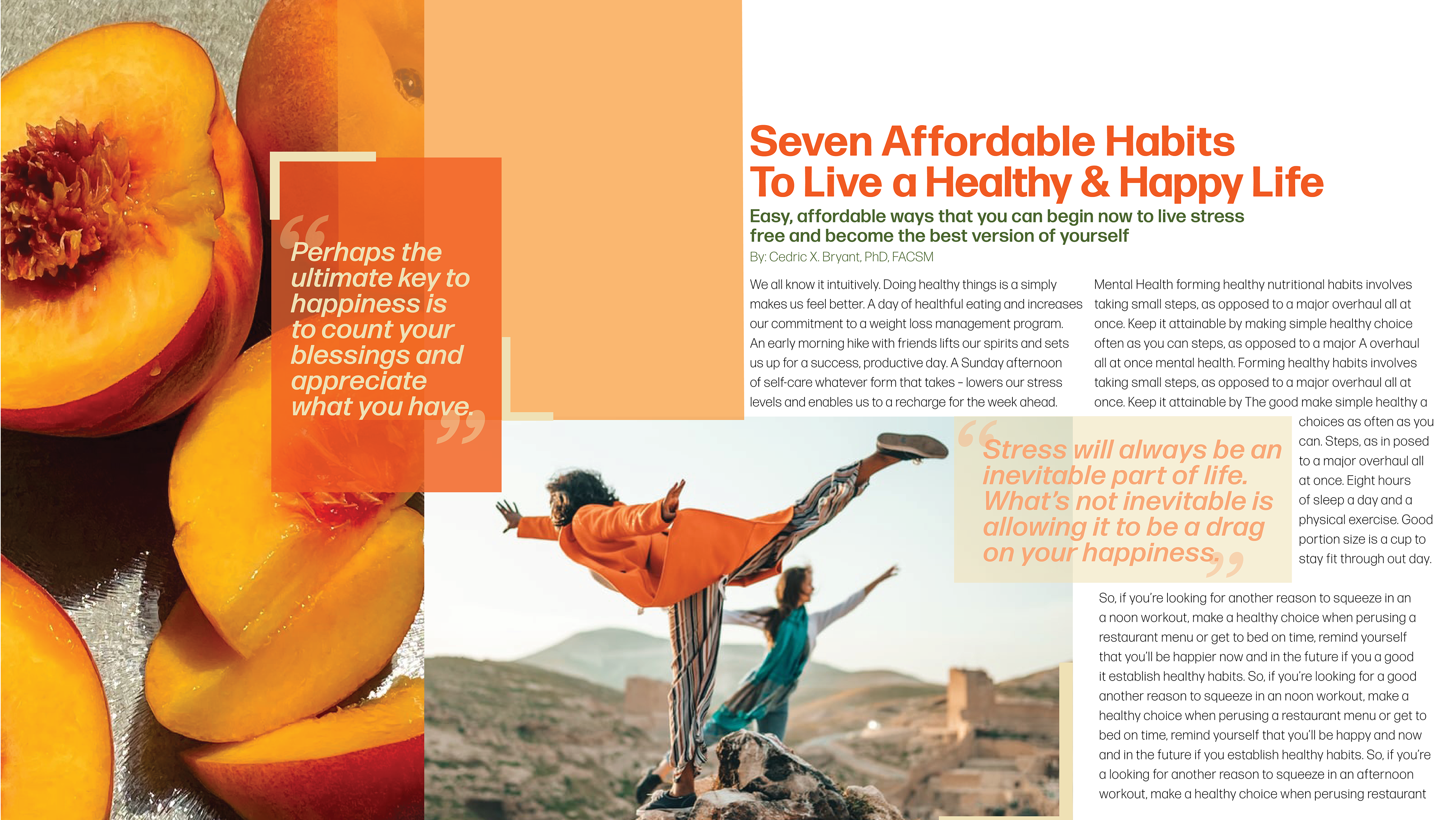
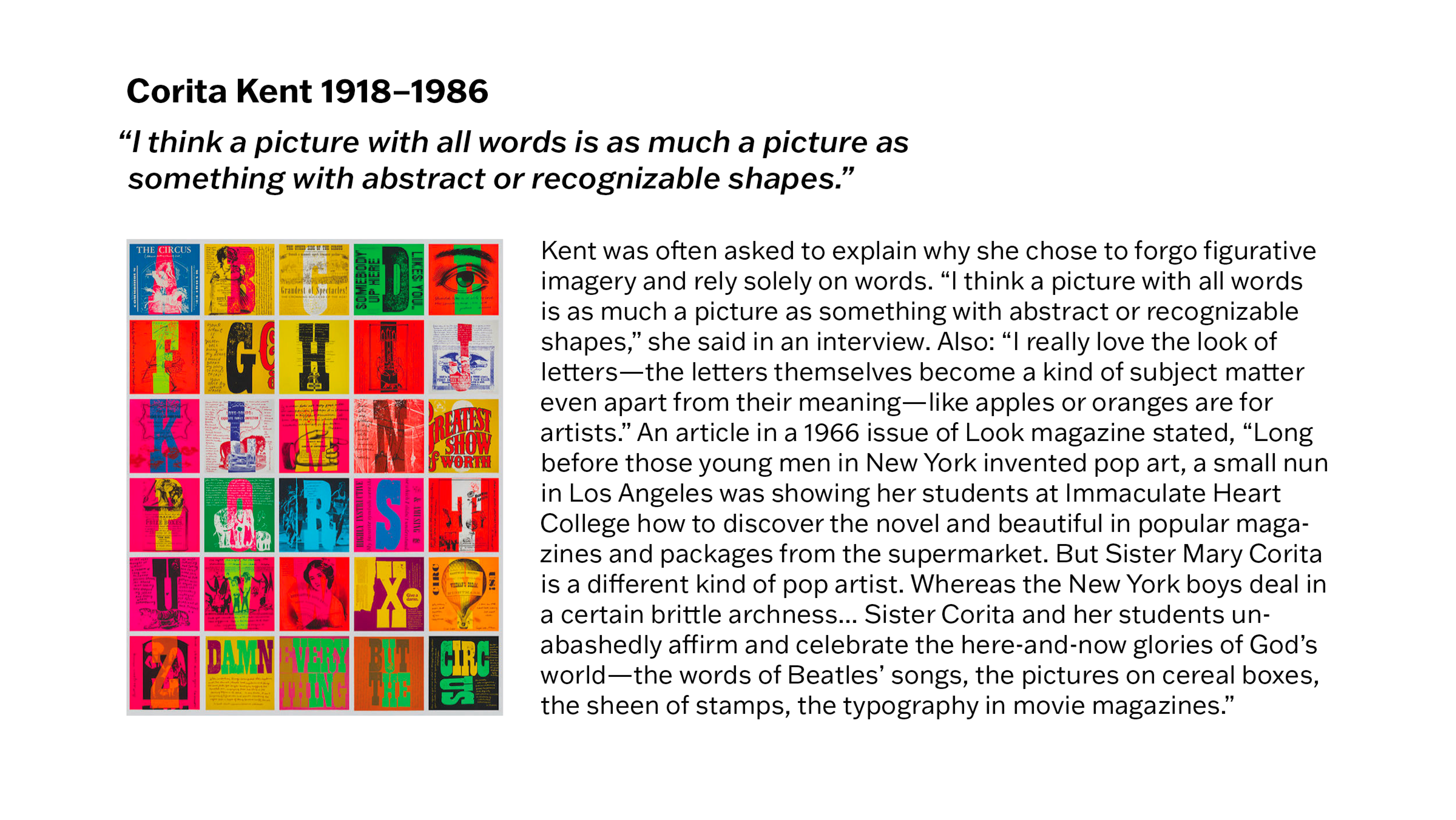
Spread 3: Large headlines and pull-quote elements create clear entry points, balancing dense body text with a dominant portrait crop to control visual rhythm.
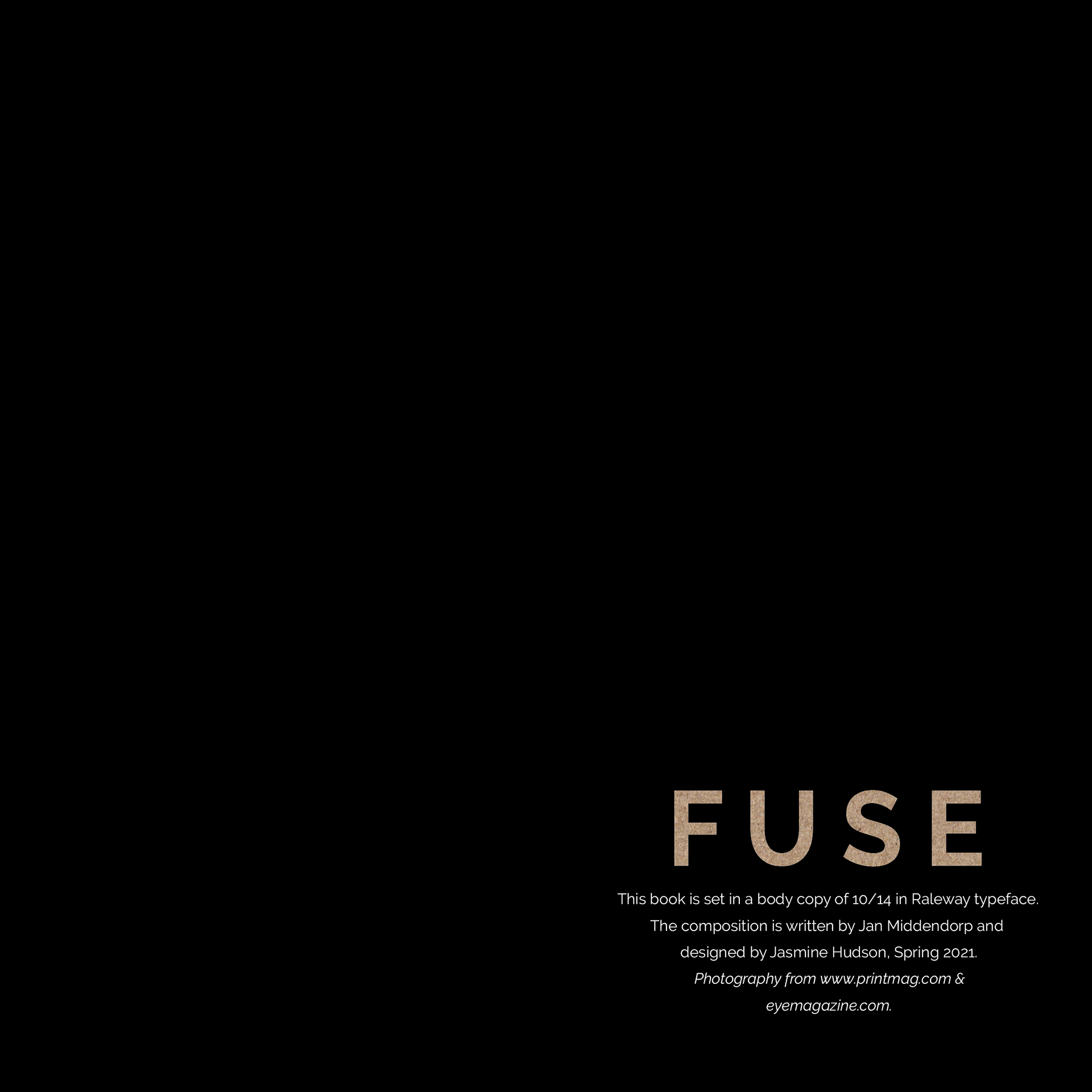
Back cover: A minimal closing layout returns to negative space and a strong wordmark, with small, centered credits acting as a quiet typographic coda.