Kent State University • Graphic Design I
Short Term Identity—Poster and Postcard
PROJECT OVERVIEW
This assignment introduced identity design as a responsive visual system developed for a time-bound event. Students researched a client organization and a specific city (domestic or international) and designed a visual program that reflects both the event’s purpose and its geographic/cultural context.
This assignment introduced identity design as a responsive visual system developed for a time-bound event. Students researched a client organization and a specific city (domestic or international) and designed a visual program that reflects both the event’s purpose and its geographic/cultural context.
METHOD PROCESS
Students investigated the organization, audience, and location to identify relevant themes, visual references, and constraints. Concepts were developed through iterative sketching and refinement, with emphasis on translating place-based and client-specific attributes into a cohesive identity. The final system prioritized clear hierarchy, consistent typography and color strategy, and cross-format adaptability.
Students investigated the organization, audience, and location to identify relevant themes, visual references, and constraints. Concepts were developed through iterative sketching and refinement, with emphasis on translating place-based and client-specific attributes into a cohesive identity. The final system prioritized clear hierarchy, consistent typography and color strategy, and cross-format adaptability.

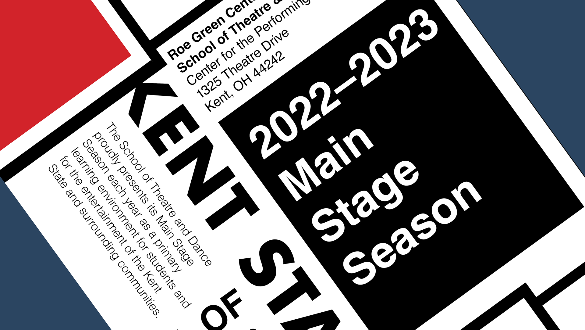
Event poster: Primary event poster built on a strong typographic scale system and simplified illustration, integrating schedule and logistical details into a unified layout.

Postcard front (cover): Postcard cover using bold display typography and layered ribbon/balloon forms to establish a cohesive festival identity and high-contrast readability.
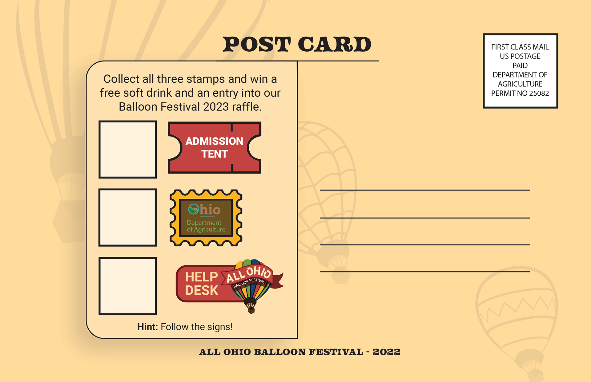
Postcard back (raffle stamp card): Interactive postcard back designed with a clear hierarchy and modular stamp grid, prompting stamp collection for raffle entry while keeping instructions and mail-panel elements cleanly separated.