This editorial feature was designed to present a policy-driven topic through a publication format that balances readability, visual impact, and structured information delivery. The project translates a complex subject—North American trade relations—into a multi-page magazine article organized through strong typographic hierarchy, image-led pacing, and strategically placed infographics. Rather than treating the article as a purely textual document, the design frames it as a sequence of distinct reading experiences, moving from a dramatic opener to denser analytical spreads and concluding with a more contained author bio and closing text.
The visual system relies on contrast between large-scale display typography, restrained body text columns, and expansive photographic fields. The opening spread establishes immediate hierarchy through oversized headline treatment and a limited red, black, and gray palette that connects the typography to the subject matter. Interior spreads use modular column structures to support long-form reading while integrating diagrams and comparative graphics without disrupting flow. Across the project, the design demonstrates editorial control, typographic discipline, and an ability to structure complex content through sequencing, scale, and visual rhythm.
Methods / Process Statement: Designed as a long-form editorial system using modular grid structure, controlled typographic hierarchy, and integrated information graphics. Page sequencing was developed to balance image-led entry points, sustained readability, and variation in visual density across the feature.
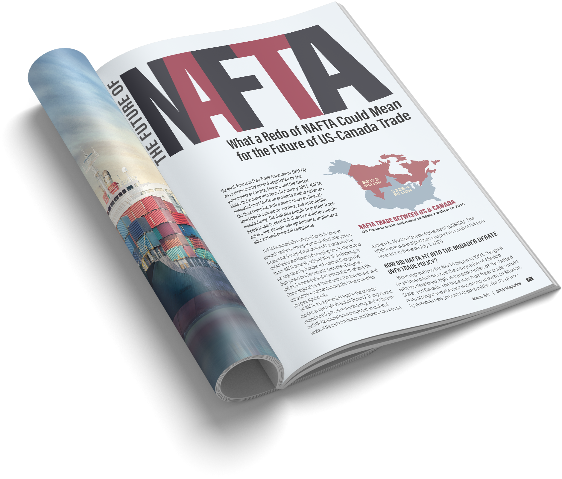
Magazine mockup showing the opener as it would function in print context. The image demonstrates how the spread’s scale relationships, headline composition, and full-bleed imagery perform as a physical publication artifact.
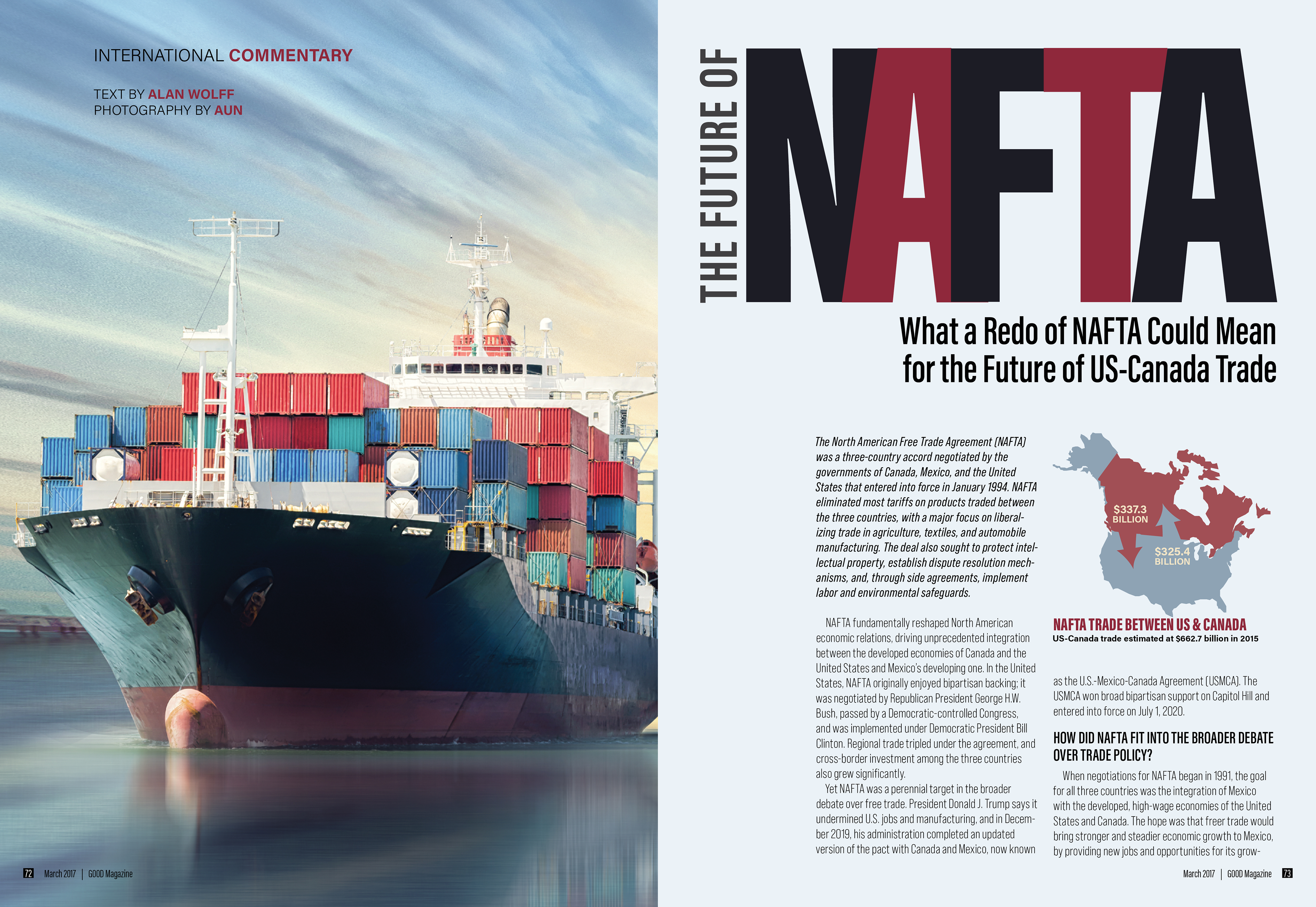
Editorial opener combining full-bleed photography with oversized display typography to establish immediate hierarchy and visual entry into the feature. The composition uses scale contrast and a restrained palette to connect headline, image, and subject matter into a unified opening gesture.
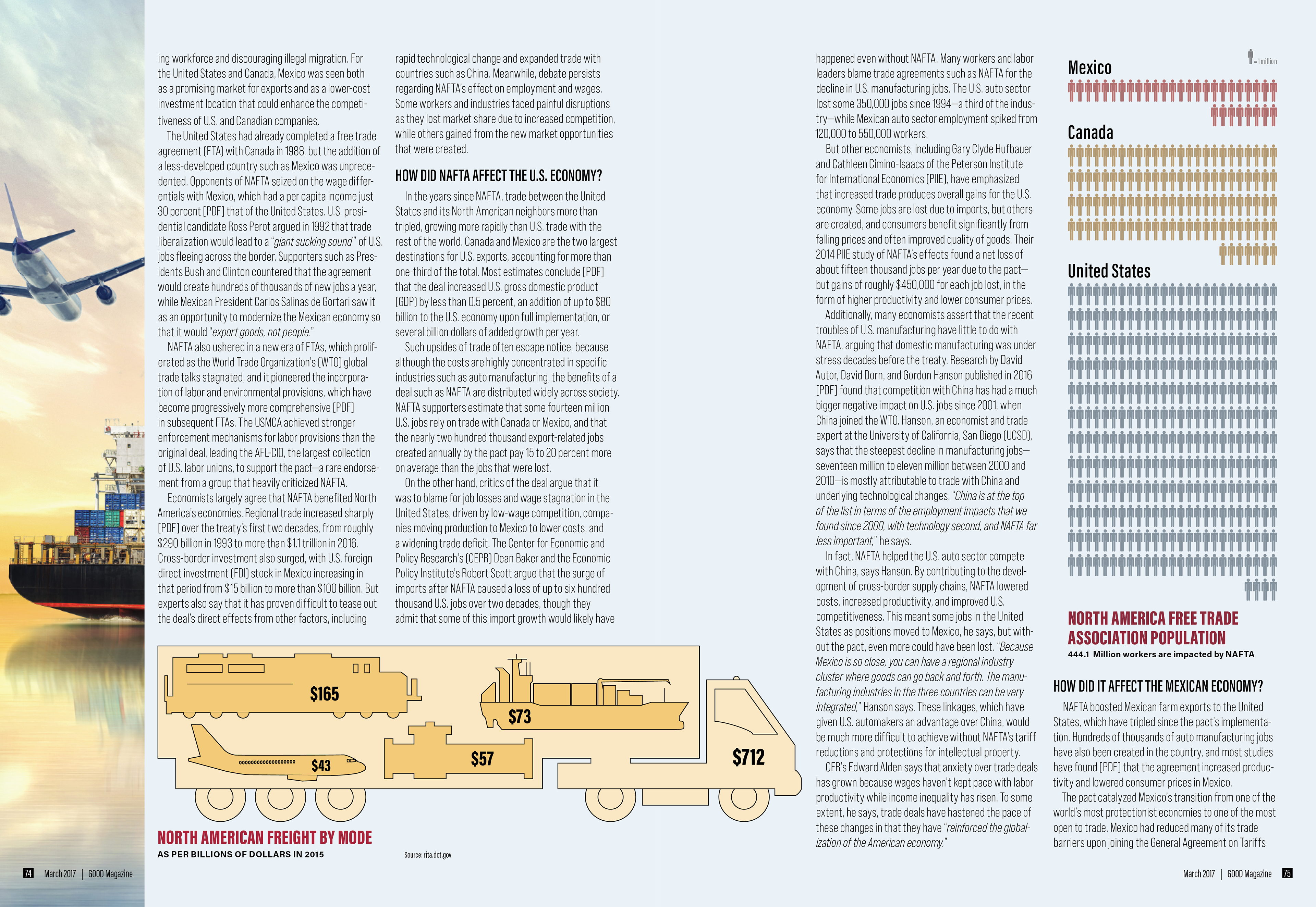
Multi-column editorial layout that organizes dense text alongside a horizontal information graphic. The spread uses consistent column structure, measured spacing, and a large bottom-aligned diagram to vary pacing while maintaining continuity across the article.
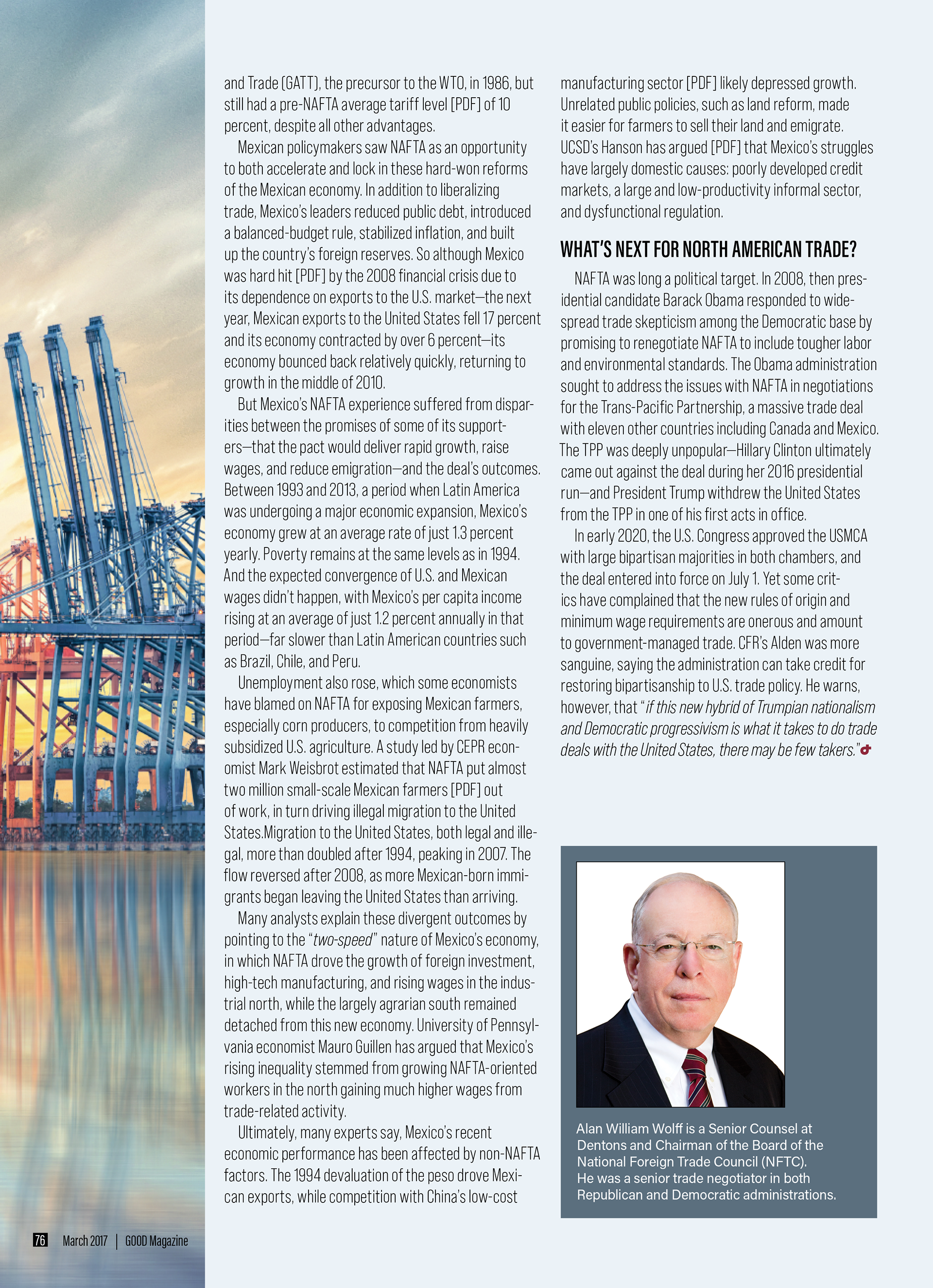
Editorial conclusion using a quieter layout structure to support extended reading and transition toward author identification. The narrower text field, simplified hierarchy, and contained portrait block create a clear closing rhythm within the larger feature.