This project extends the Traveling Stanzas initiative through public-facing design that places poetry in everyday civic space. Developed for Kent State University’s Wick Poetry Center, the work translates a poem about recovery into large-format communication intended for broad public encounter rather than gallery or page-based reading. The design problem is therefore both literary and spatial: to preserve the integrity of the poem while making it visually legible, emotionally resonant, and accessible across formats associated with public circulation and community engagement.
The visual approach relies on strong figure-ground contrast, large-scale typography, and a layered relationship between text and image. A hand-drawn anatomical torso functions as the primary image field, while repeated handwritten language creates texture, rhythm, and conceptual reinforcement across the composition. In the poster, the poem is organized through a clear typographic hierarchy against a dark field, with the illustrated form emerging through contrast and fragmentation. In the transit application, the design adapts the same visual language to a panoramic horizontal format, demonstrating cross-platform control while maintaining continuity of tone, structure, and message.
As a portfolio project, the work demonstrates the ability to translate poetic content into a public communication system that operates across scale, surface, and audience. It shows particular strength in typographic hierarchy, image-text integration, and format adaptation, while also reflecting a design practice attentive to social context and the communicative role of visual form in public space.
Methods / Process Statement
Designed as a cross-format public communication system using digitally composited typography, illustration, and layered image treatment. Layout and scale relationships were adapted to support both poster presentation and transit-based application while preserving hierarchy, legibility, and visual continuity.
Designed as a cross-format public communication system using digitally composited typography, illustration, and layered image treatment. Layout and scale relationships were adapted to support both poster presentation and transit-based application while preserving hierarchy, legibility, and visual continuity.
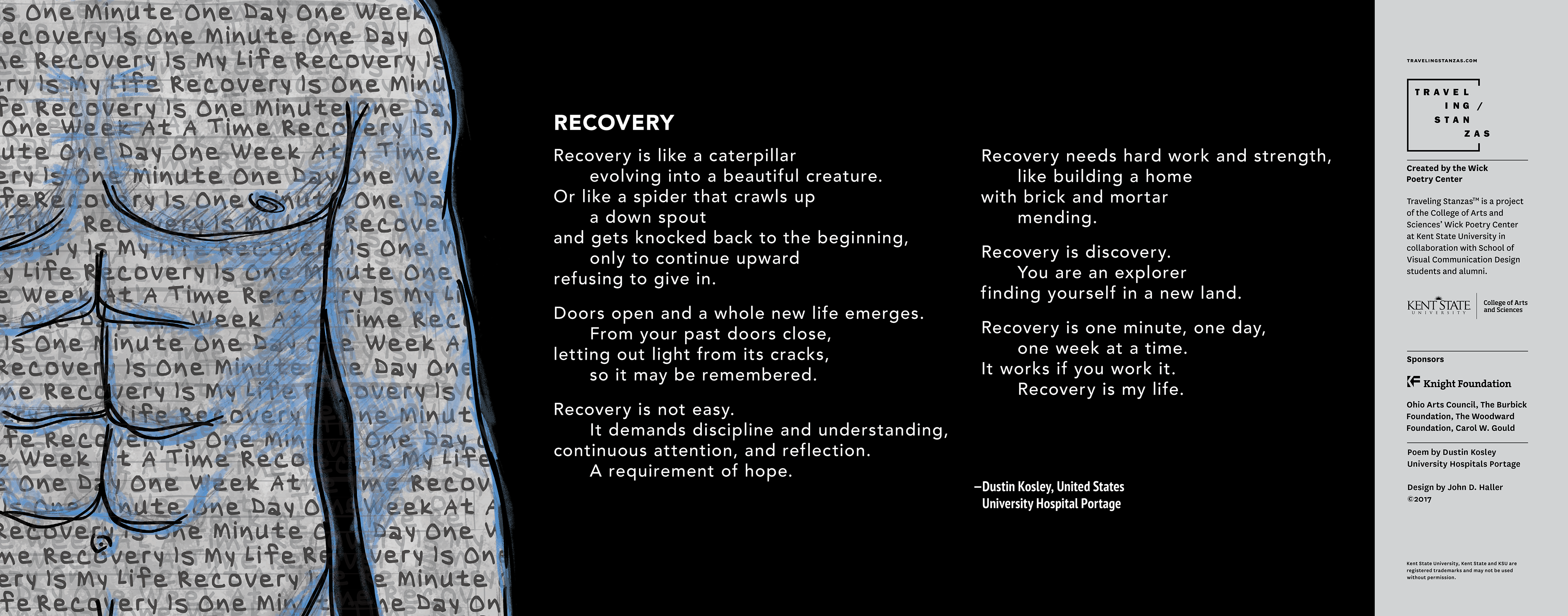
Transit-based public poetry graphic translating the Traveling Stanzas visual system to a wide horizontal format. The composition uses cropped illustration, repeated handwritten text, and centered poem typography to maintain hierarchy and legibility across a moving public surface.
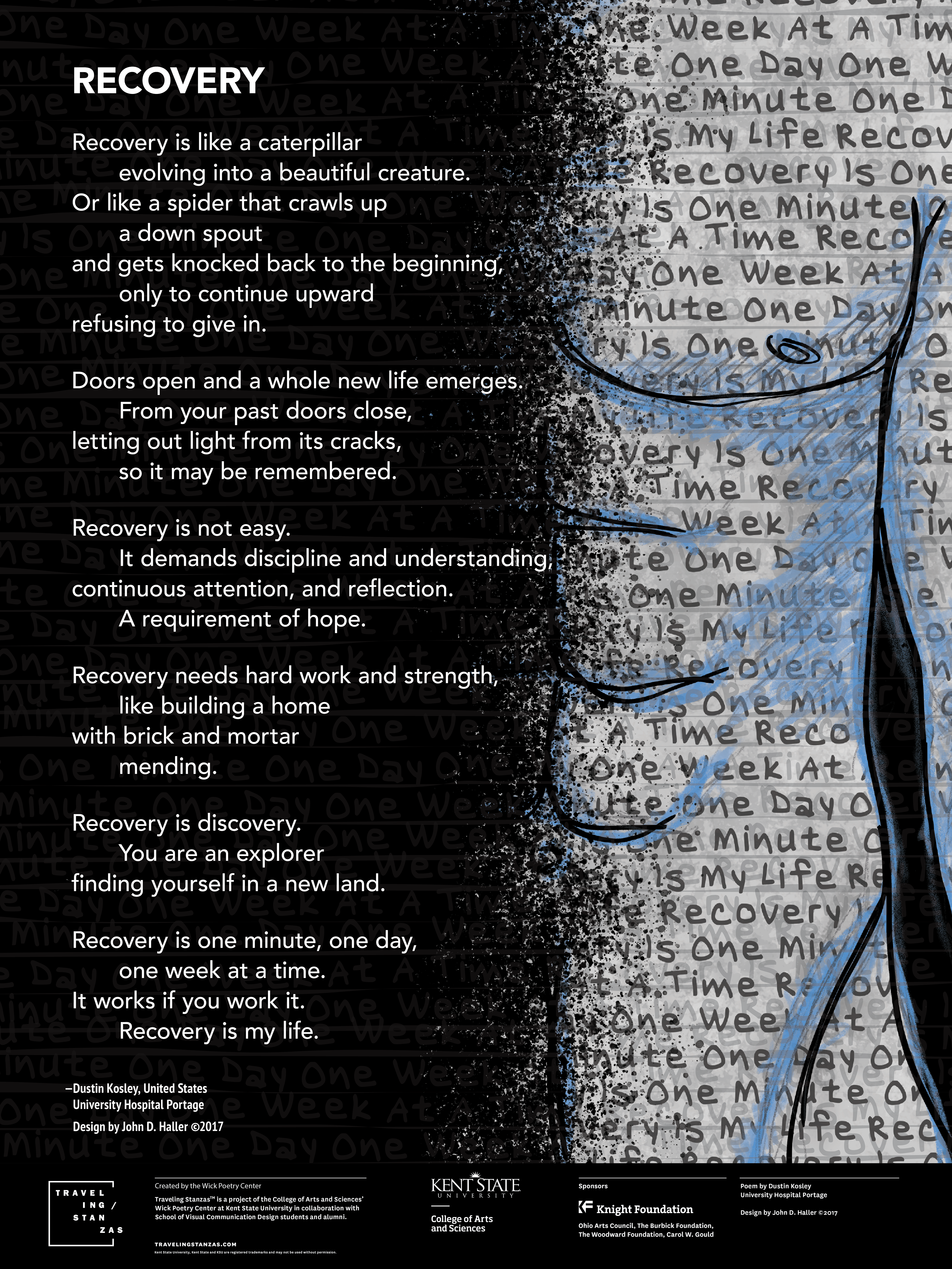
Public poetry poster using high-contrast type, layered text texture, and expressive illustration to frame the poem as both reading experience and visual encounter. The design balances dense atmospheric patterning with a clear content structure that supports emphasis, pacing, and attribution.