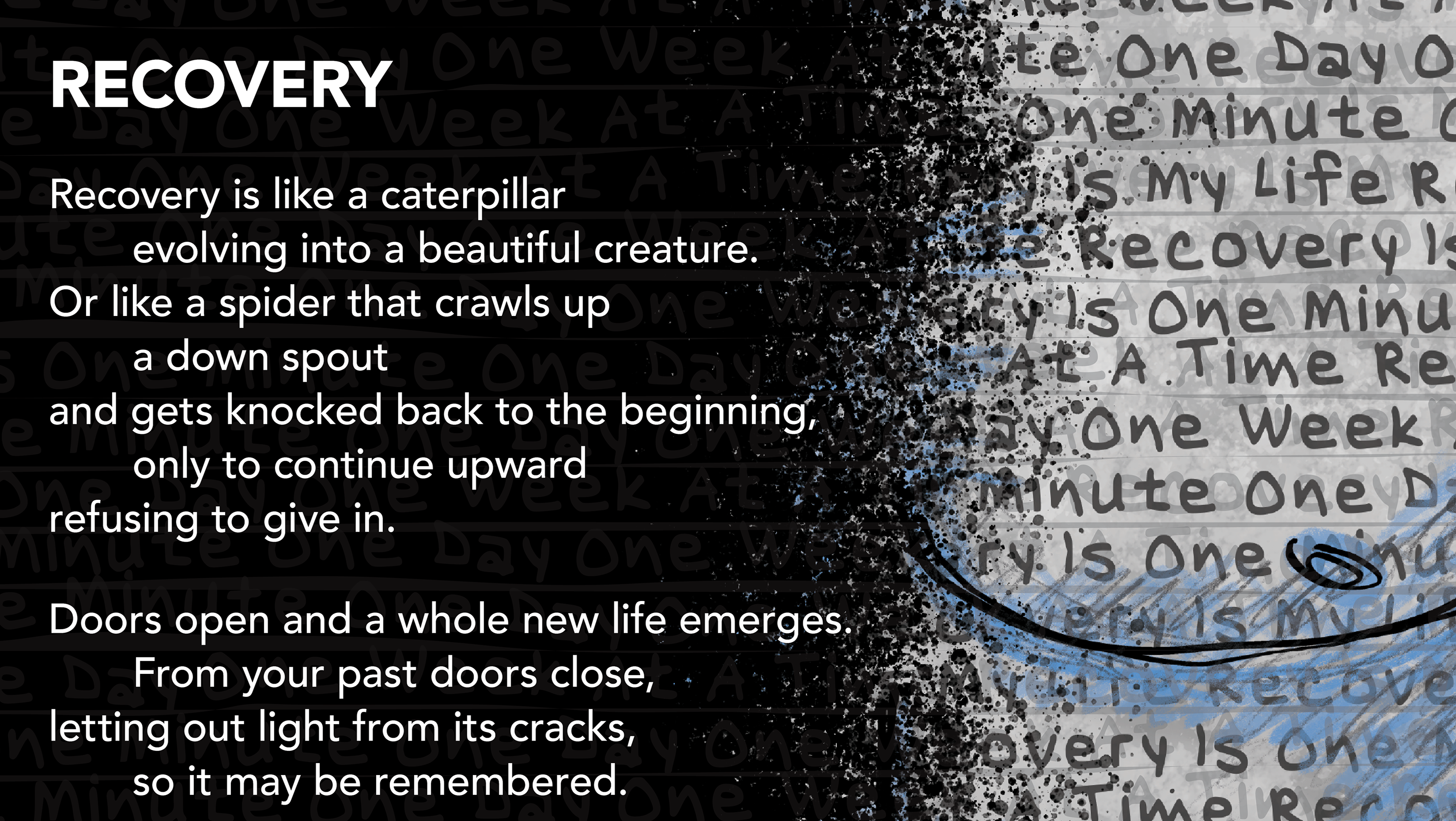
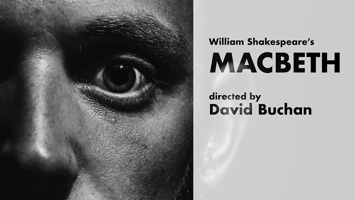
This poster was developed to promote a theatrical production through a composition that emphasizes movement, hierarchy, and spatial tension. Rather than relying on illustrative narrative, the design uses typography and layered geometric form to establish visual drama and guide the viewer through key production information. The title is treated as the primary image, scaled and angled to create immediate impact while integrating with the larger compositional system.
The poster’s visual structure is built through diagonals, repeated bands, and rounded linear forms that suggest momentum and transition. A restrained palette of muted blue, warm gray, and off-white supports legibility while contributing to a cohesive atmospheric tone. Supporting information is positioned within the directional movement of the layout, allowing the event details to remain accessible without interrupting the formal energy of the piece. The project demonstrates an approach to poster design grounded in typographic hierarchy, compositional control, and the integration of expressive form with promotional clarity.
Methods / Process Statement
Designed and digitally constructed using vector-based tools, with emphasis on typographic scale, diagonal composition, and layered shape systems to coordinate hierarchy, mood, and informational clarity.
Designed and digitally constructed using vector-based tools, with emphasis on typographic scale, diagonal composition, and layered shape systems to coordinate hierarchy, mood, and informational clarity.
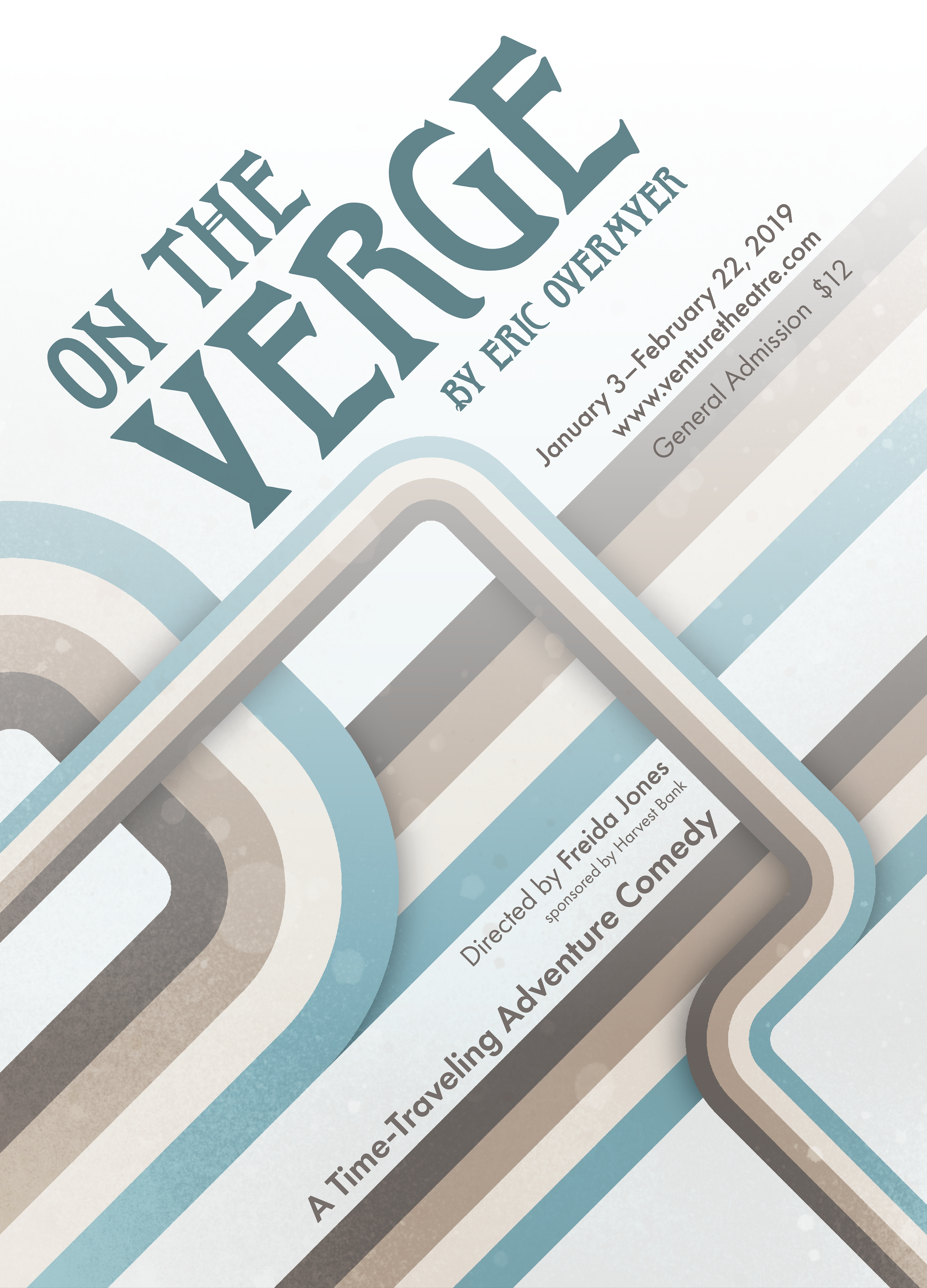
Theatre poster using large-scale typographic hierarchy and angled composition to create a strong promotional focal point. Layered geometric bands and a limited color palette establish rhythm and movement while organizing production details within the overall visual system.