This project develops a conference brochure for a Wayzgoose event as an editorial system that balances functional program information with a strong typographic identity. The publication is tasked with organizing a large volume of schedules, speaker information, venue content, acknowledgements, and reference material while maintaining visual coherence across the full brochure. Rather than treating the piece as a neutral informational handout, the design positions the brochure as an extension of the event itself, using typography, pacing, and formal repetition to create a publication that is both navigable and visually distinctive.
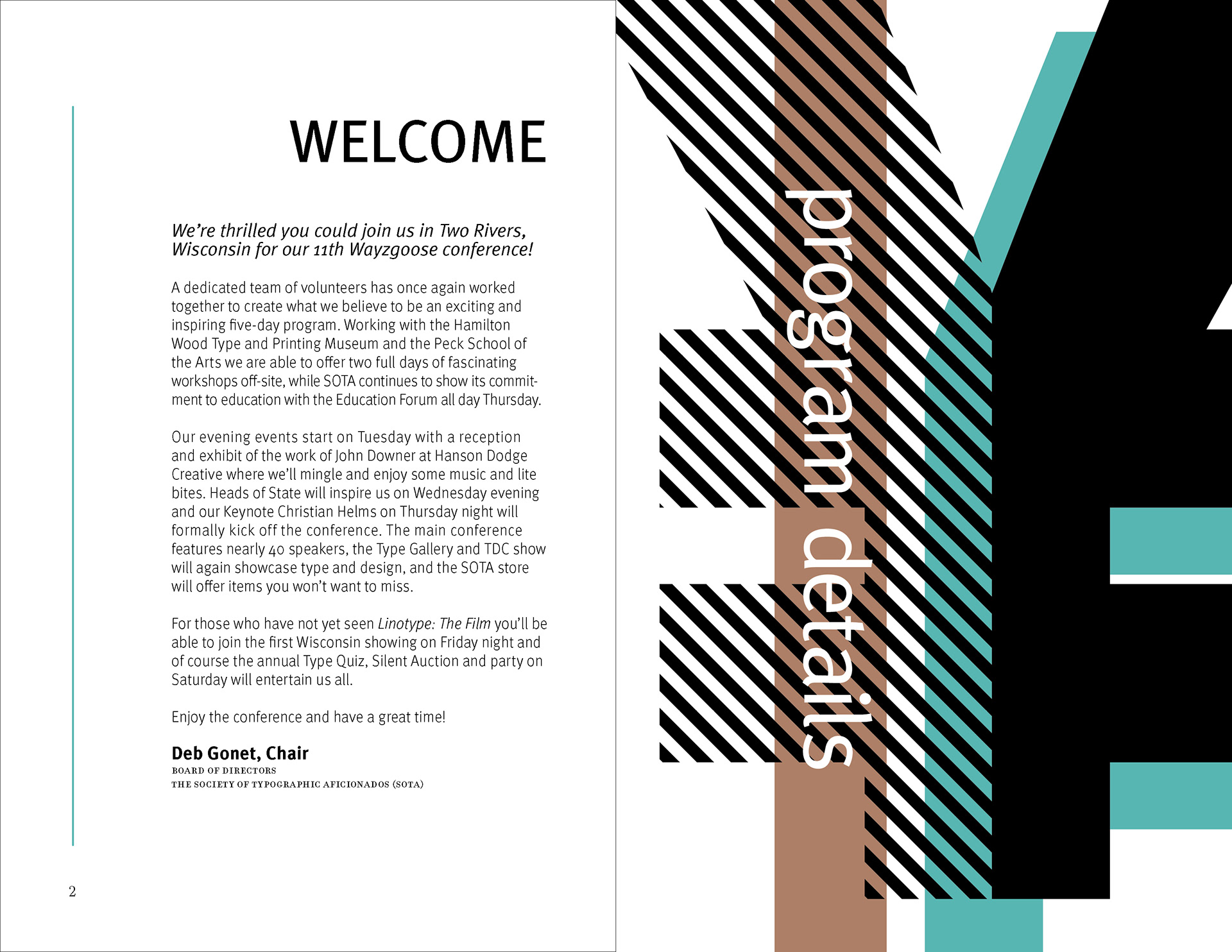
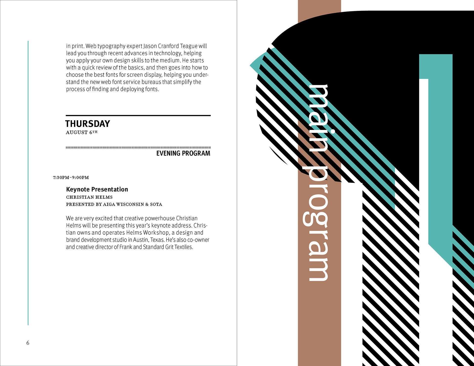
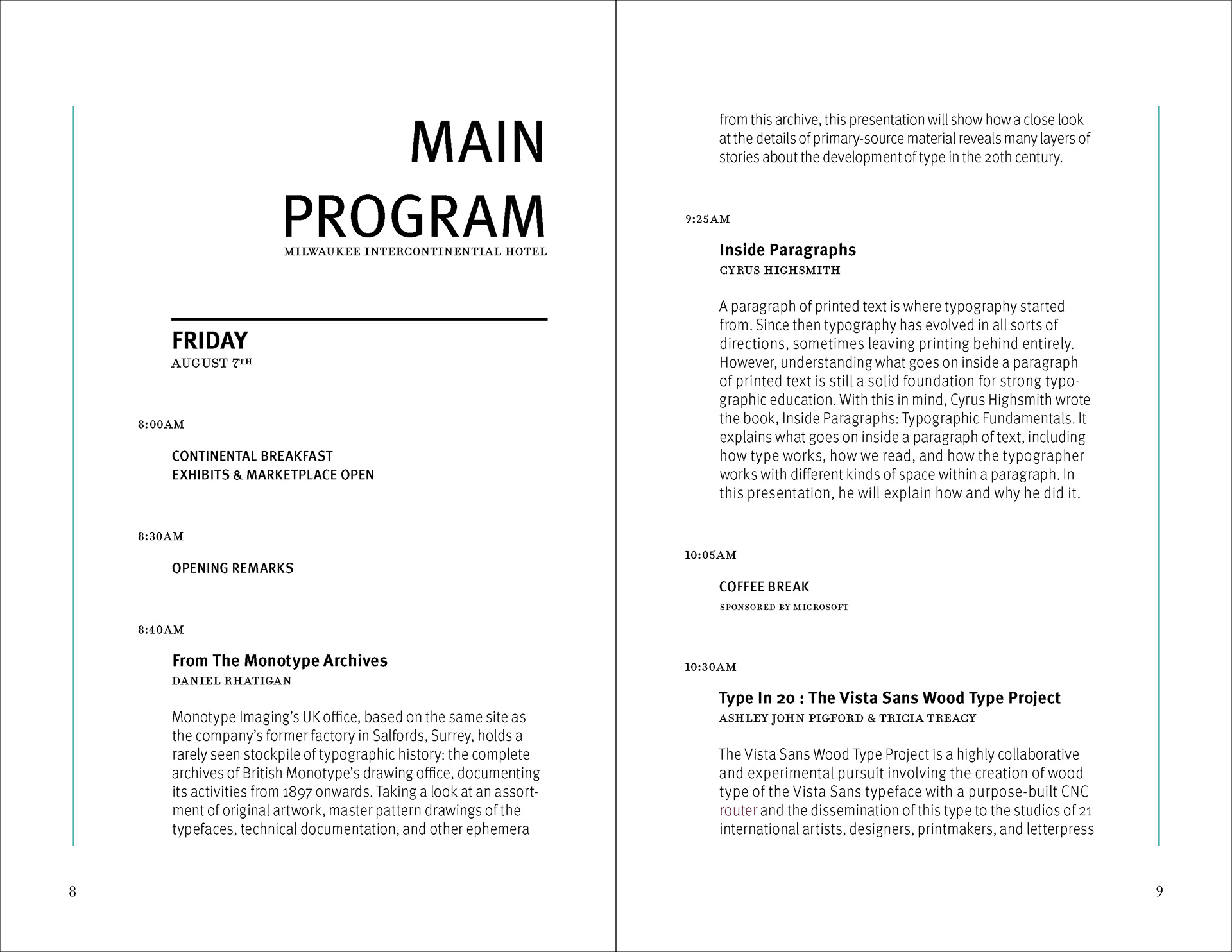
The design strategy relies on a clear contrast between expressive divider pages and highly structured information spreads. Large cropped letterforms, diagonal striping, and a restrained palette of black, white, aqua, and muted brown establish a recognizable visual language that moves throughout the brochure. In the content-heavy spreads, that language is moderated through disciplined margins, stable column structures, and carefully managed hierarchy so that schedules and descriptions remain readable. This interplay between energetic formal composition and controlled editorial organization allows the brochure to function as both a communication tool and a designed reading experience.
As a portfolio project, the brochure demonstrates editorial sequencing, typographic hierarchy, systems thinking, and formal decision-making within publication design. The work shows an ability to build a consistent visual system across many pages while adapting layout density, pacing, and emphasis to different kinds of content. It also reflects production-aware design thinking, in which visual identity, information structure, and reader usability are treated as interdependent parts of the same publication system.
Methods / Process Statement
The brochure was developed as a unified editorial system organized through a modular grid, consistent typographic hierarchy, and repeated sectional pacing. Large typographic forms and graphic patterning were used as navigational and identity elements, while schedule and informational pages were structured through disciplined column alignment, spacing logic, and production-aware layout decisions appropriate to a multi-page conference publication.
The brochure was developed as a unified editorial system organized through a modular grid, consistent typographic hierarchy, and repeated sectional pacing. Large typographic forms and graphic patterning were used as navigational and identity elements, while schedule and informational pages were structured through disciplined column alignment, spacing logic, and production-aware layout decisions appropriate to a multi-page conference publication.
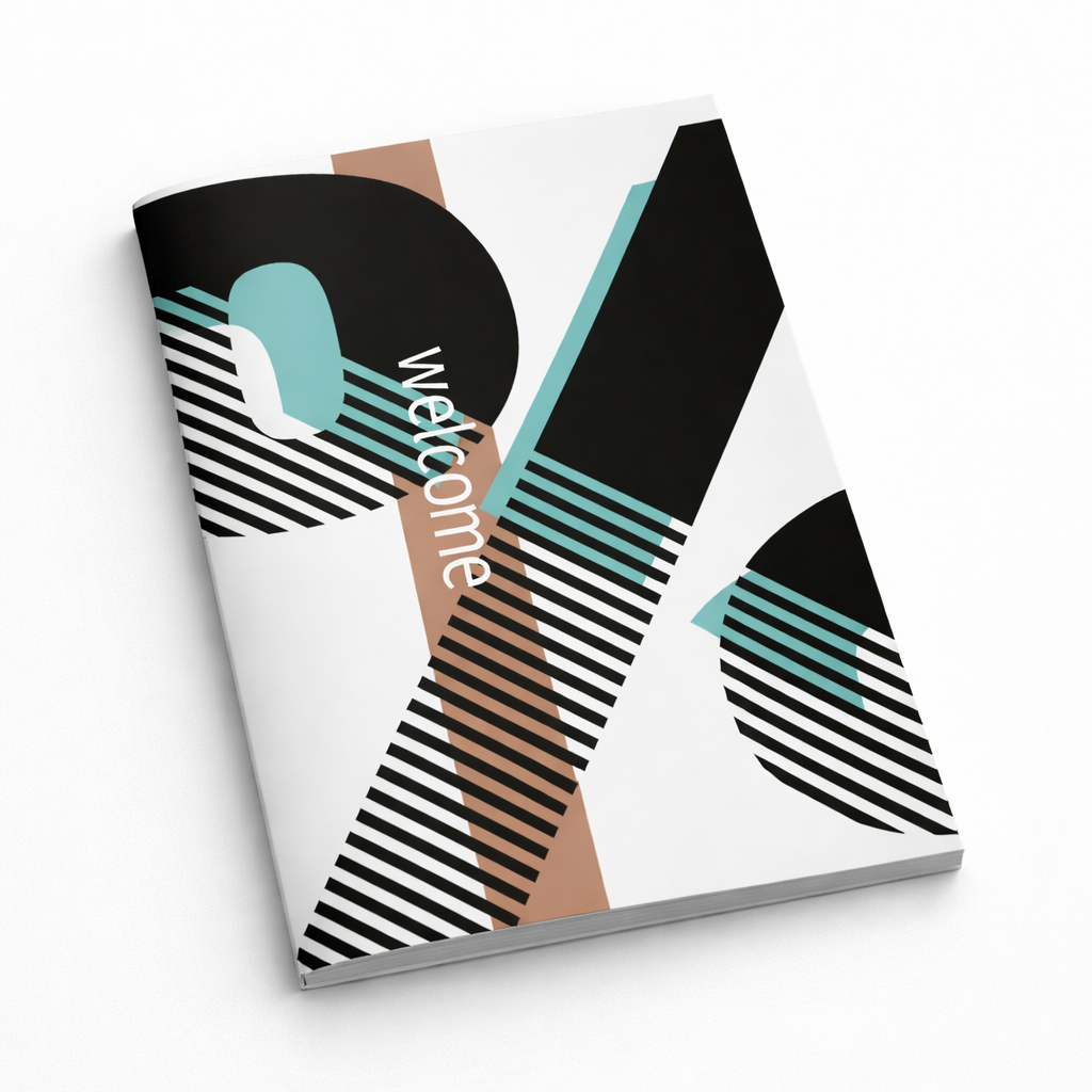
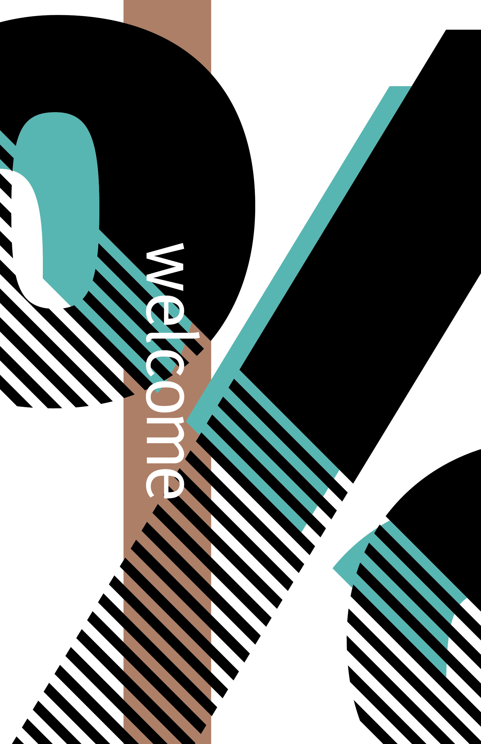
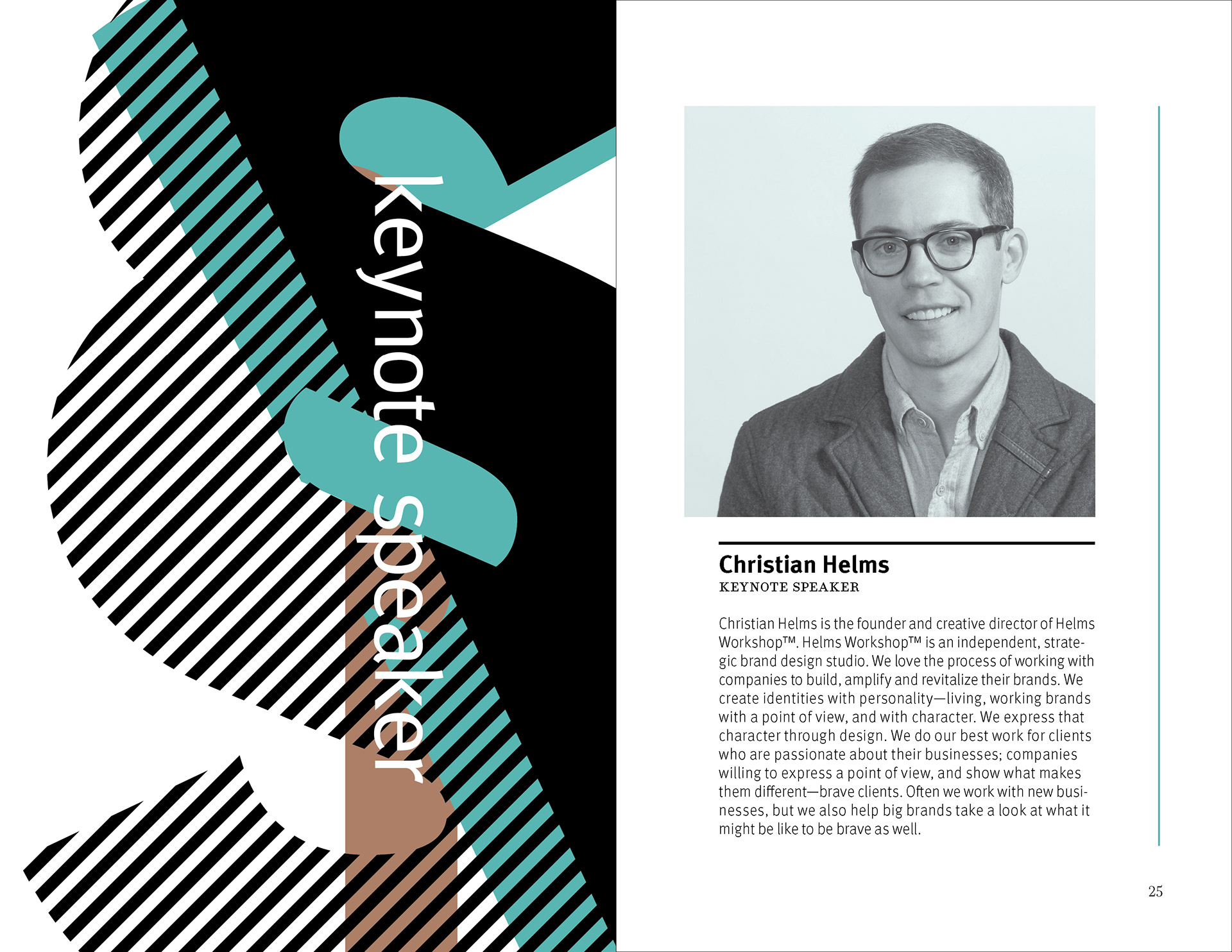
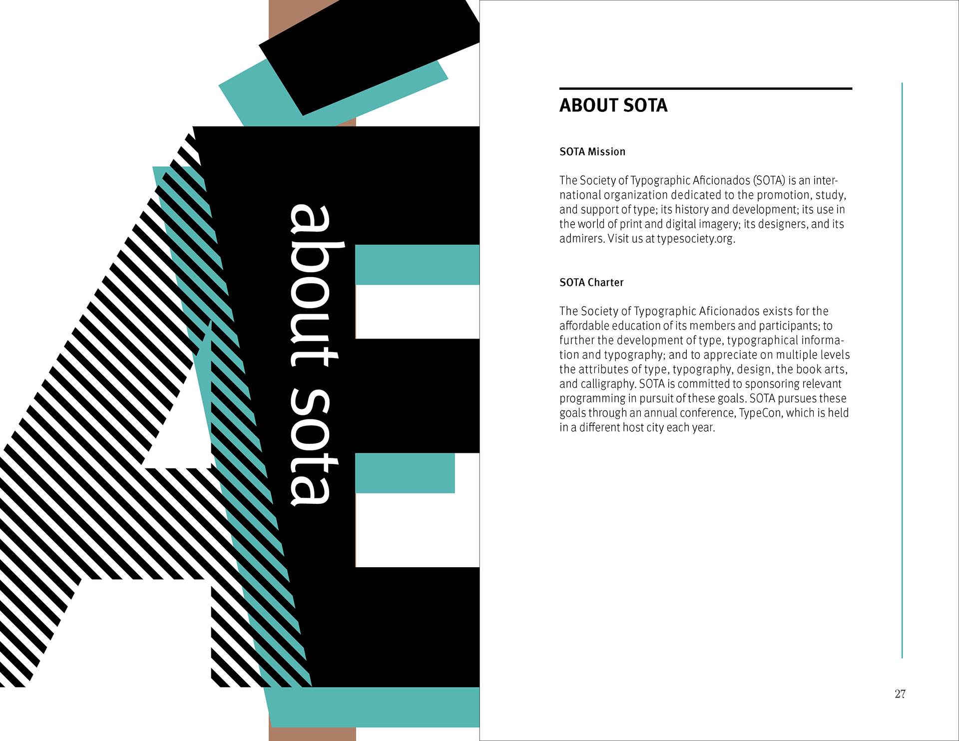
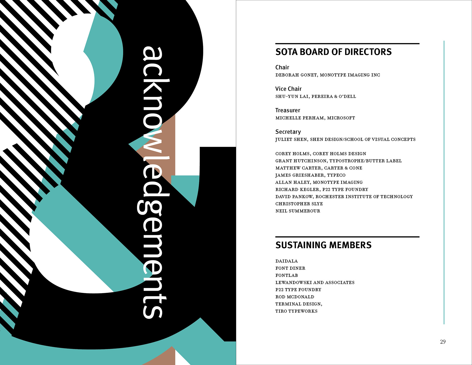
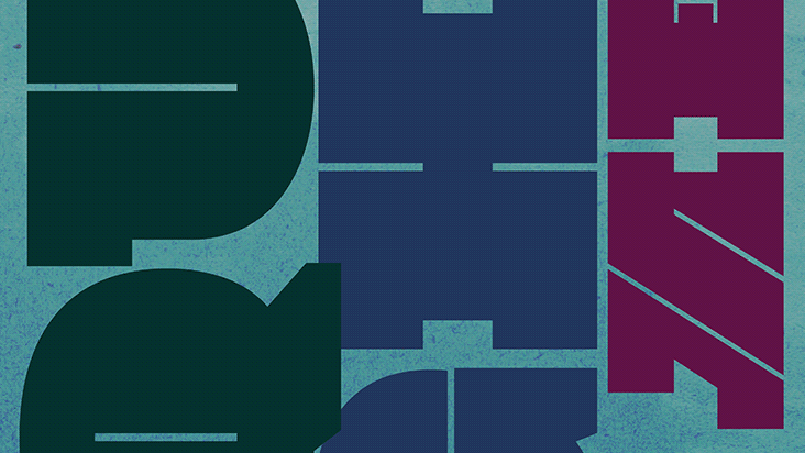
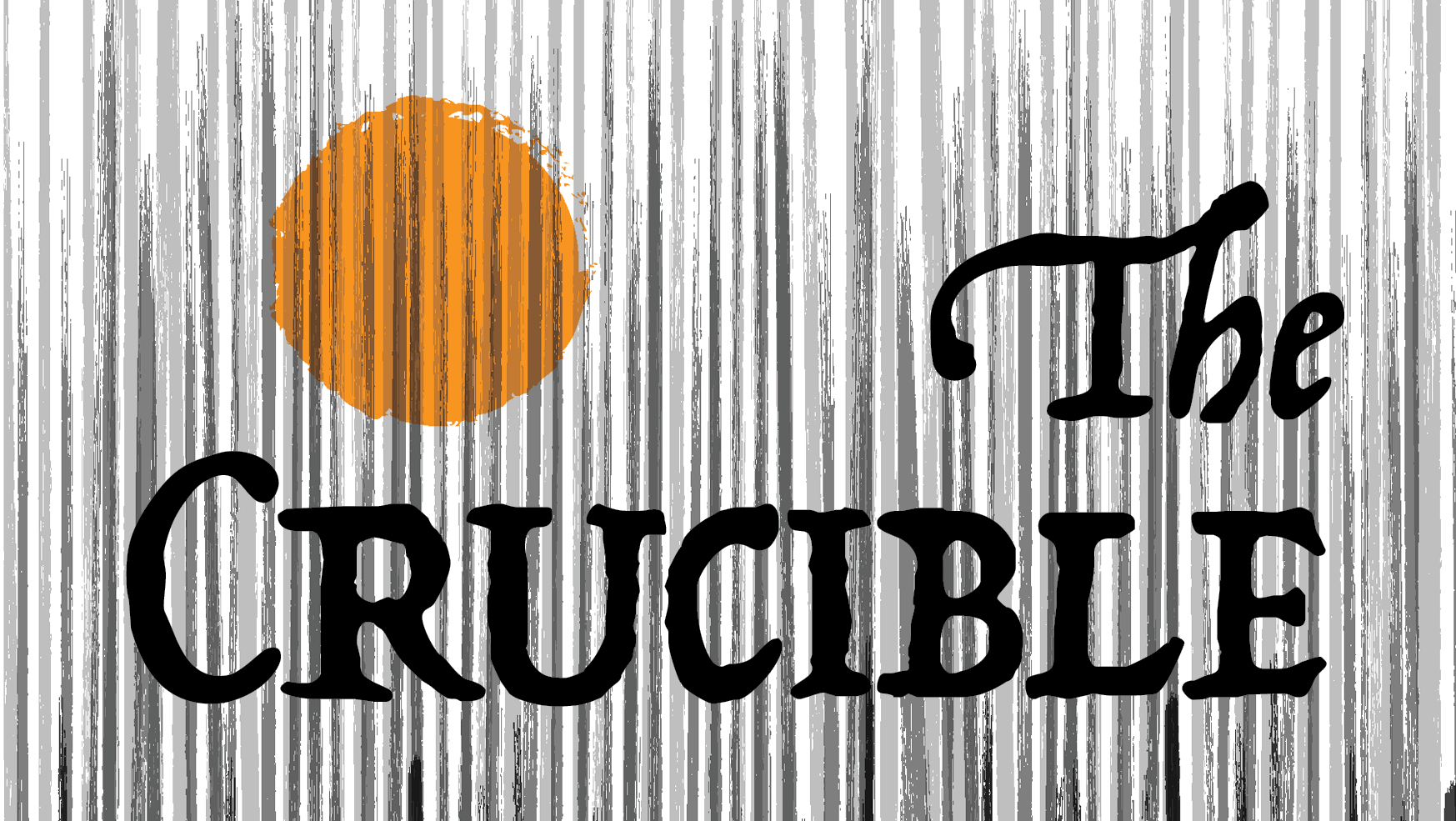
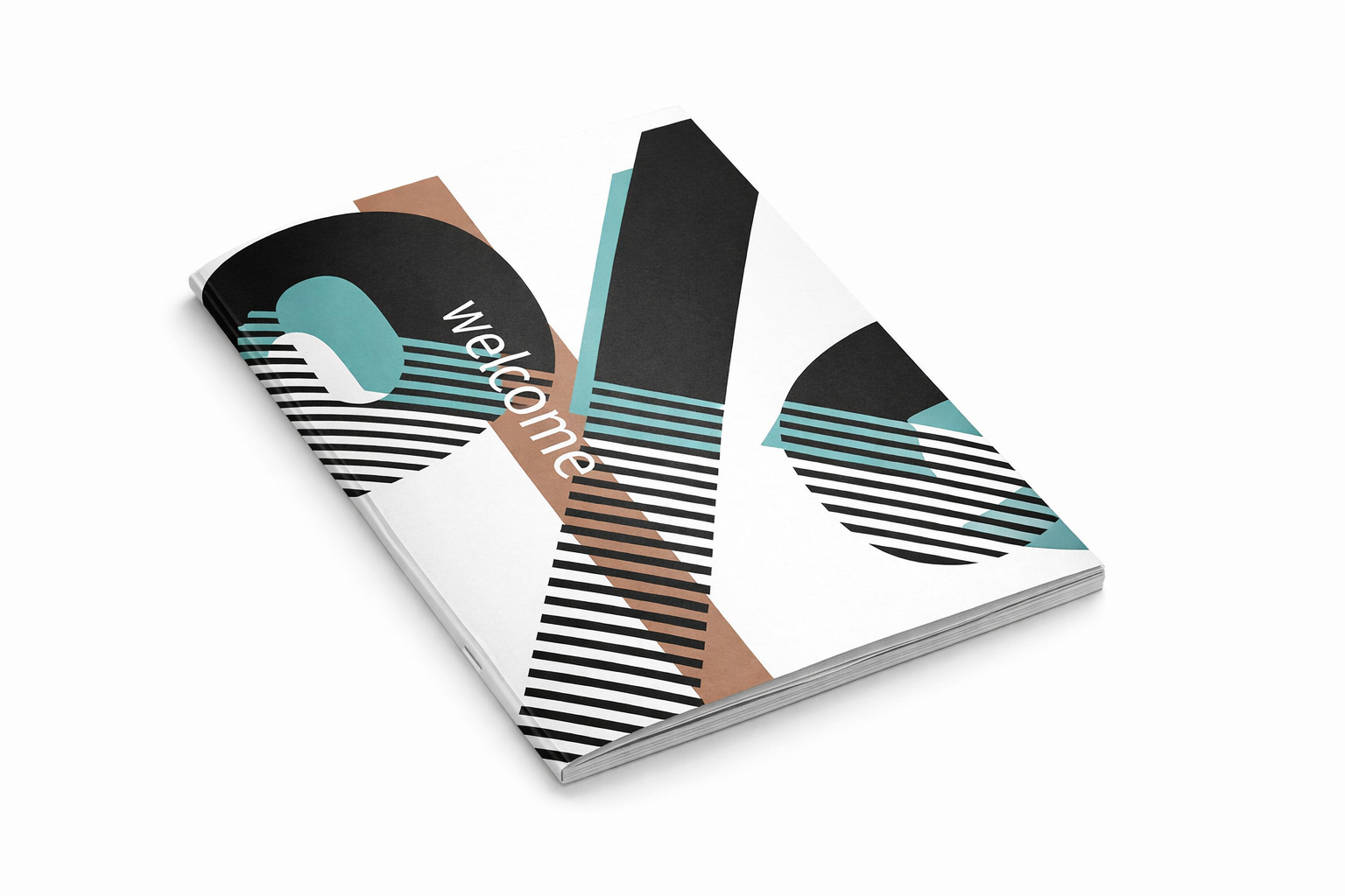
Publication cover exploring geometric abstraction through oversized black forms, diagonal striping, and limited accent color to establish contrast, rhythm, and a clear visual focal point. The composition uses layered shape relationships and vertical type placement to create movement across the cover while maintaining a restrained editorial structure.