This poster uses scale, contrast, and atmospheric illustration to establish a clear promotional hierarchy for a theatrical production. The title is set at oversized scale in a high-contrast red against a deep blue field, allowing the production name to function as the primary visual anchor. Supporting information is organized in descending levels of emphasis, moving from the illustrated night scene to production credits, dates, venue details, and contact information.
The composition relies on a strongly centralized image structure: a bright moon, silhouetted trees, and layered translucent forms create depth while reinforcing the play’s reflective, romantic tone. Rather than depending on photographic realism, the poster uses simplified vector-based forms and controlled color relationships to build mood and support legibility. The design demonstrates an approach to event promotion in which typography and image work together as an integrated communication system, balancing expressive atmosphere with functional clarity for public-facing theatre advertising.
Methods / Process Statement
Designed as a vector-based promotional poster using contrast, scale, and layered shape construction to unify atmosphere and information delivery within a single-format theatre communication piece.
Designed as a vector-based promotional poster using contrast, scale, and layered shape construction to unify atmosphere and information delivery within a single-format theatre communication piece.
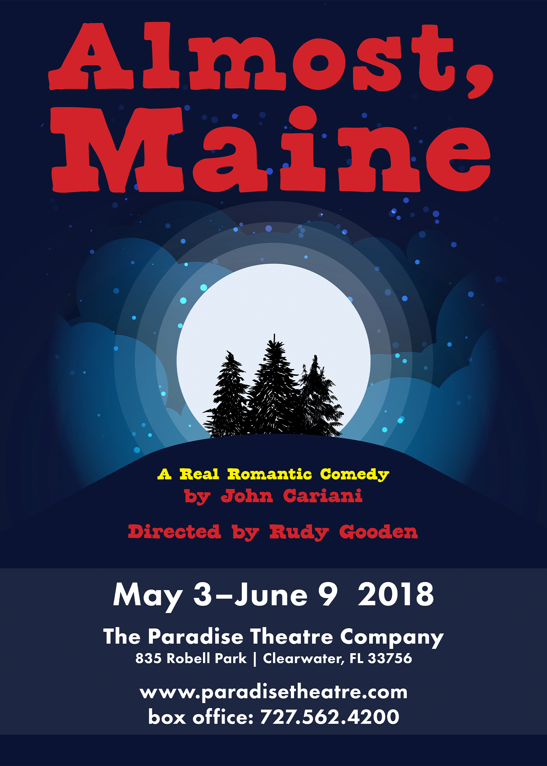
Event poster using oversized display typography, high color contrast, and a centralized illustrated scene to create immediate visual impact and establish a clear information hierarchy. The layered moonlit landscape supports the tone of the production while the lower text block consolidates dates, venue, and contact information into a readable promotional structure.