Kent State University • Introduction to Visual Communication Design, Studio
Free Placement: Page Layout Series
PROJECT OVERVIEW
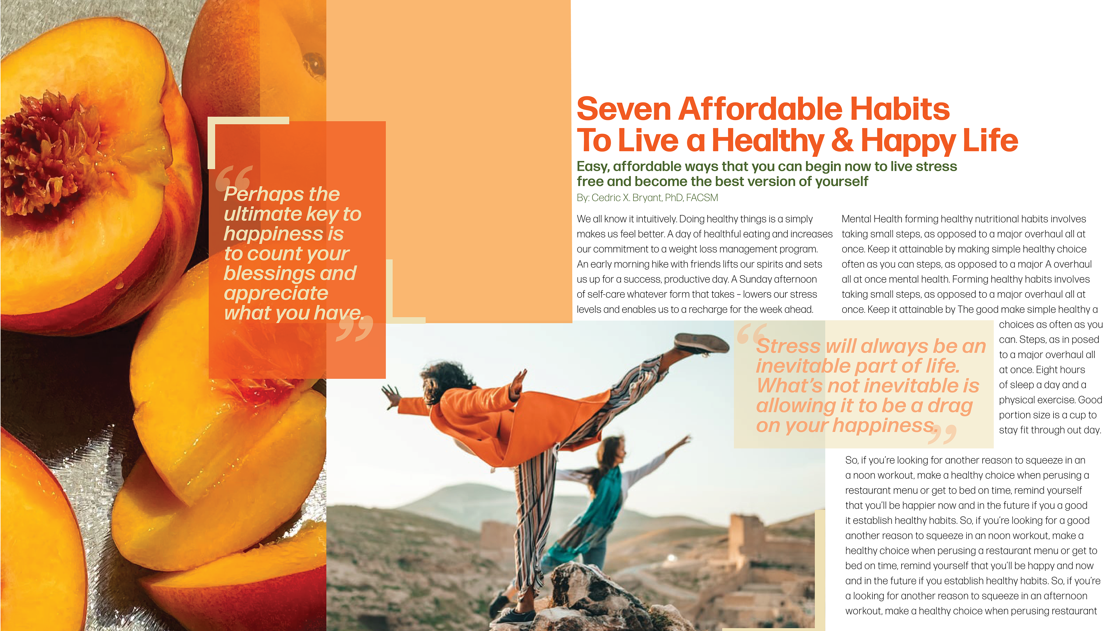
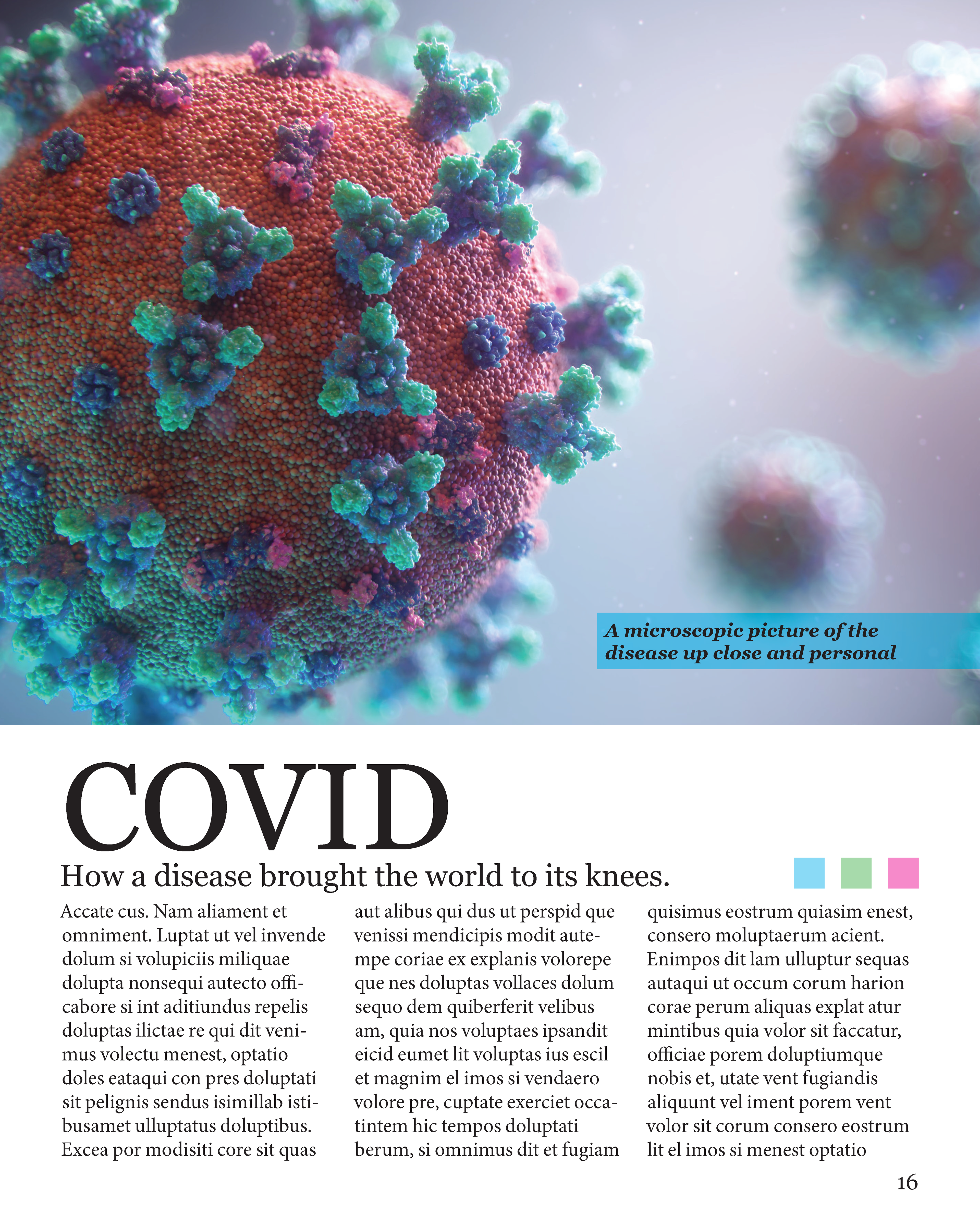
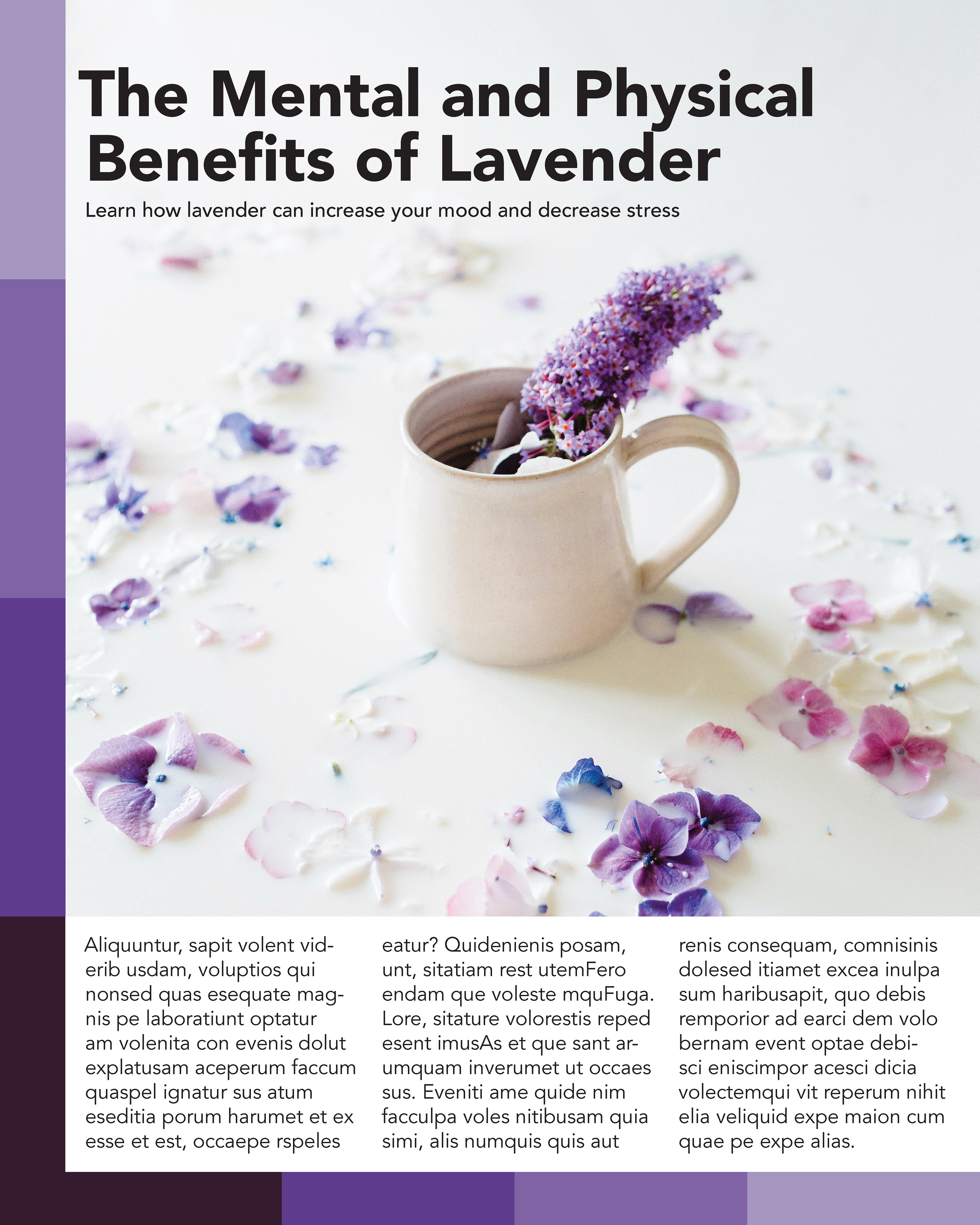
This final project focused on compositional hierarchy through free-form page layout. Students produced two related compositions combining typography with a selected Unsplash image: one solution designed to be image-dominant and one designed to be text-dominant. To keep the emphasis on layout decisions (grid, alignment, scale, contrast, and spatial relationships) rather than typographic refinement, students set the body copy in Lorem ipsum placeholder text.
This final project focused on compositional hierarchy through free-form page layout. Students produced two related compositions combining typography with a selected Unsplash image: one solution designed to be image-dominant and one designed to be text-dominant. To keep the emphasis on layout decisions (grid, alignment, scale, contrast, and spatial relationships) rather than typographic refinement, students set the body copy in Lorem ipsum placeholder text.
METHOD / PROCESS
Students selected an image and supporting text, then developed two distinct hierarchy strategies using scale, contrast, placement, and negative space. The image-dominant layout emphasized the photograph through size and positioning, while the text-dominant layout shifted emphasis to typographic structure with the image treated as secondary support. As a culminating assignment, the work was completed independently without critique during the design process.
Students selected an image and supporting text, then developed two distinct hierarchy strategies using scale, contrast, placement, and negative space. The image-dominant layout emphasized the photograph through size and positioning, while the text-dominant layout shifted emphasis to typographic structure with the image treated as secondary support. As a culminating assignment, the work was completed independently without critique during the design process.
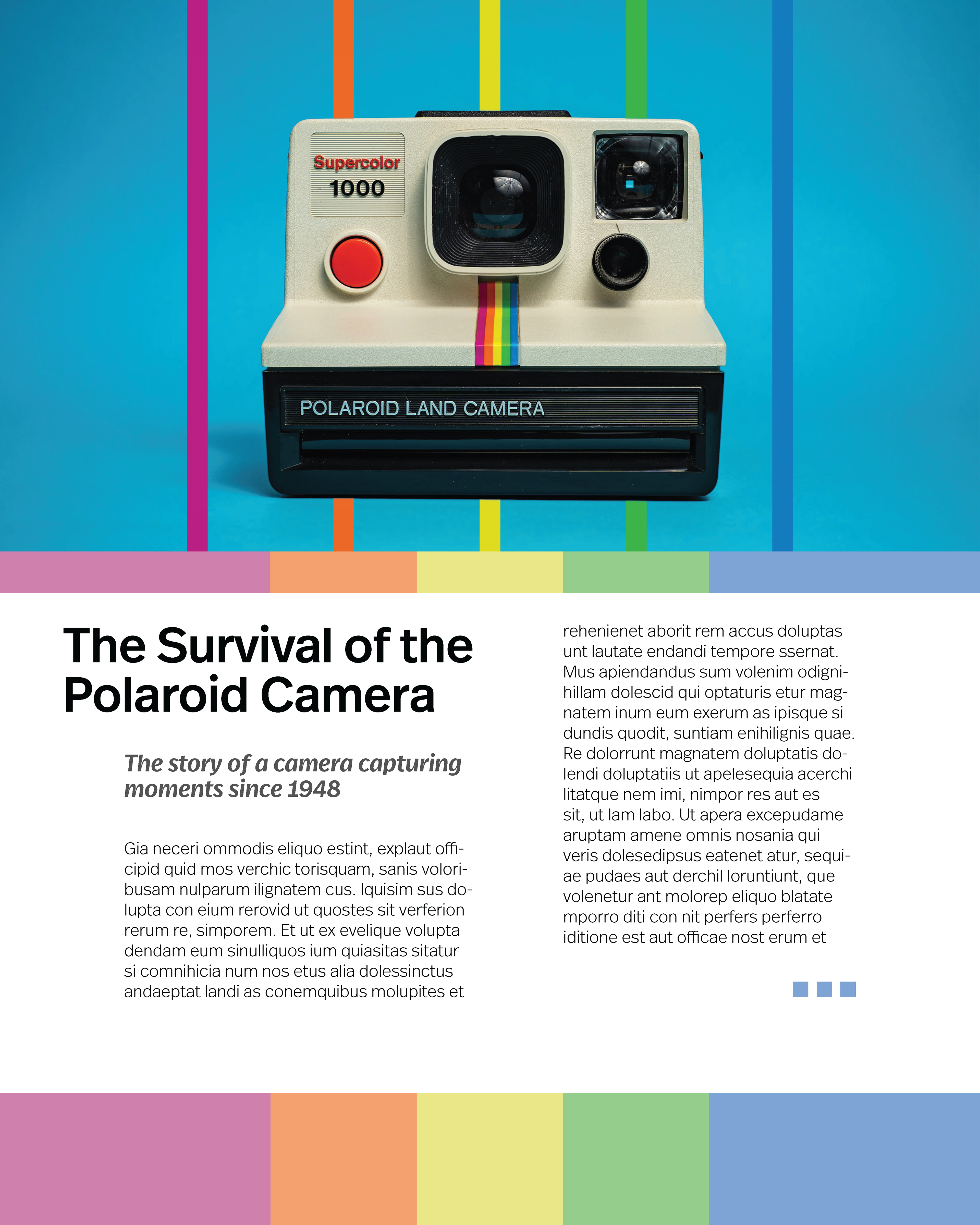
Mason D’Amore: Image-dominant layout using a centered hero photograph and saturated color bands to create a strong focal point and establish a clear typographic hierarchy below.
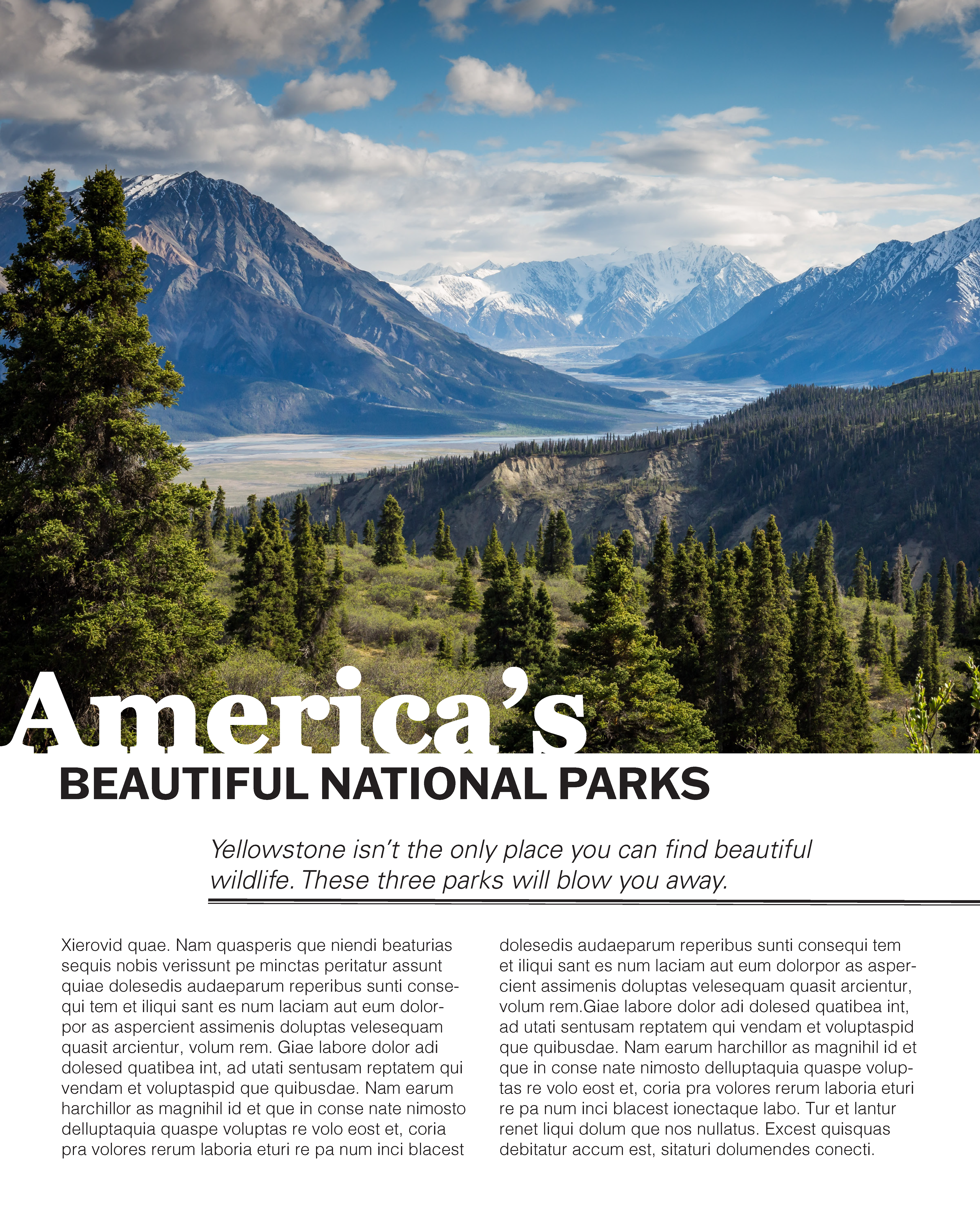
Jenna Fader: Text-dominant composition anchored by a full-bleed landscape image, with a bold headline lockup and two-column grid to support readability and structured pacing.
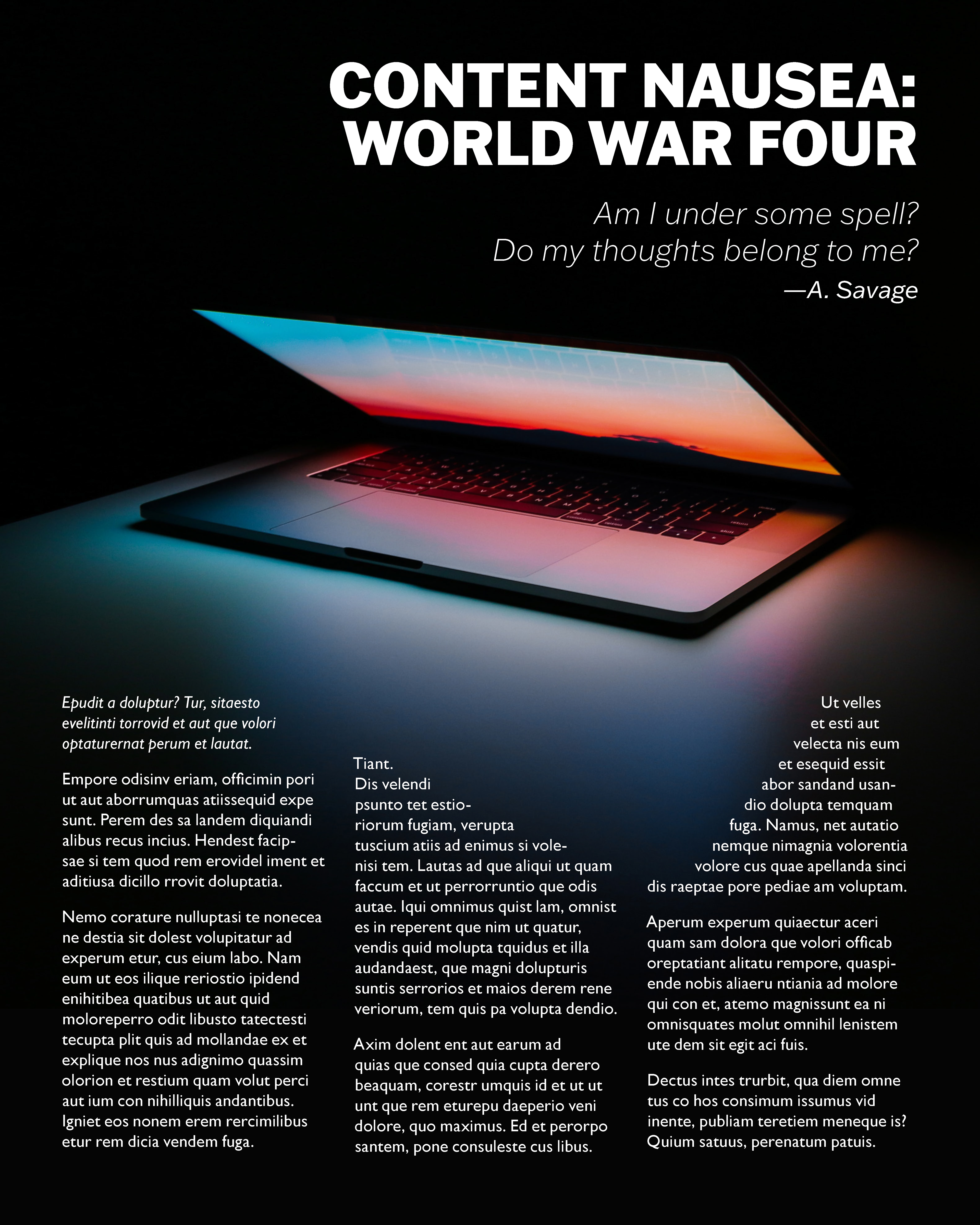
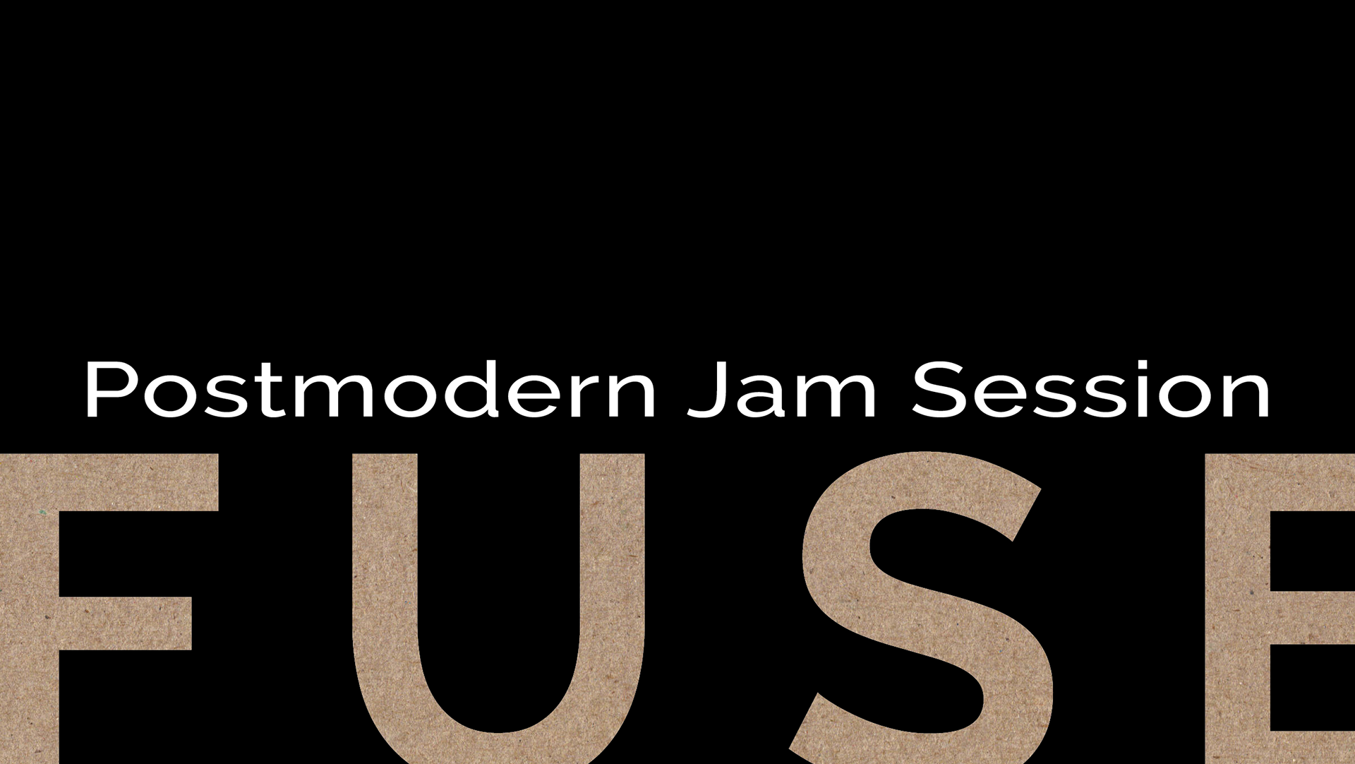
Colten Kee: High-contrast, image-led layout using a dark field and cinematic photography to create mood, with typographic hierarchy driven by scale, weight, and generous negative space.
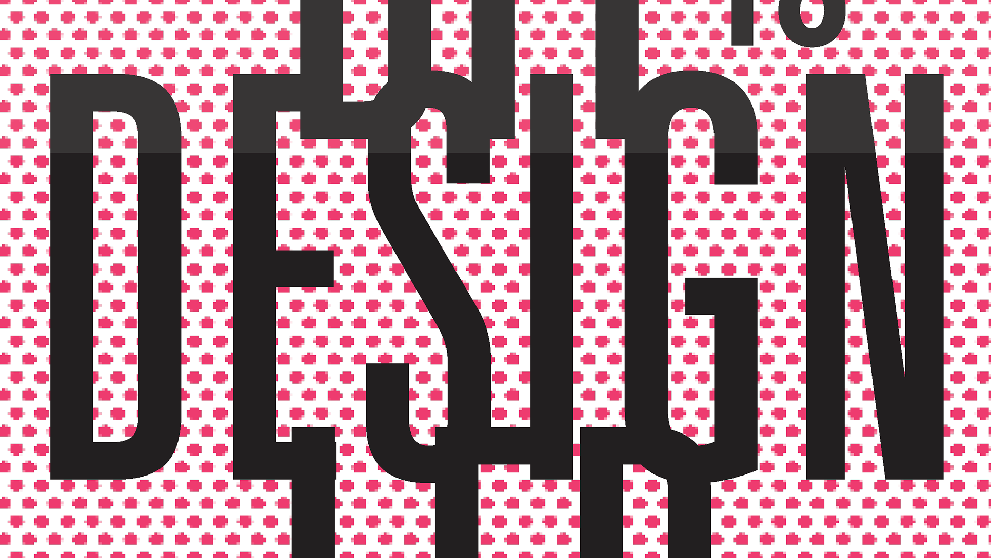
Tisa Manandhar: Image-forward page using a large-scale macro visual and a restrained caption bar to frame the content while keeping the typography secondary and controlled.
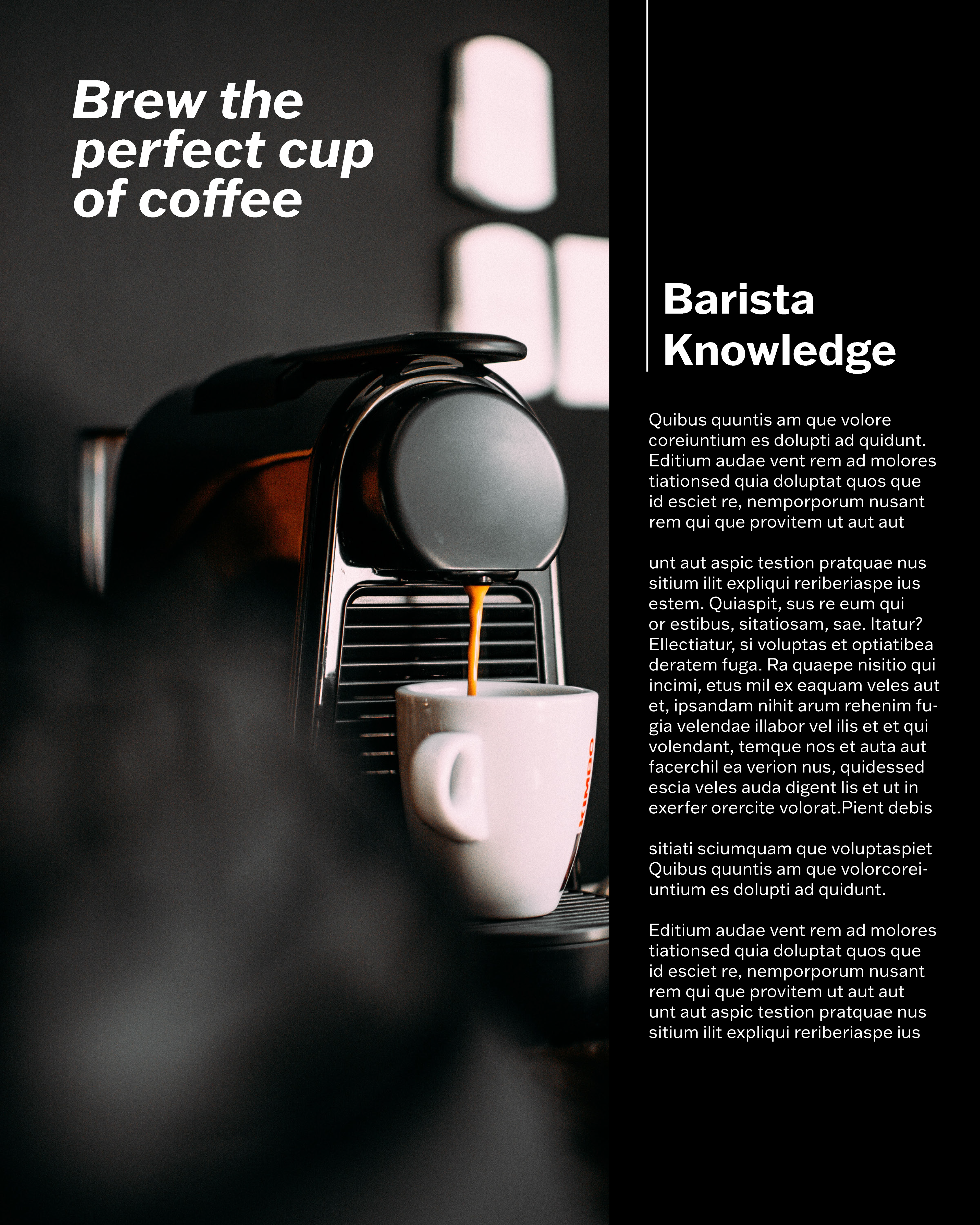
Tim Trepal: Split layout balancing a dominant photographic panel with a vertical text column, using alignment and contrast to guide the reading path.
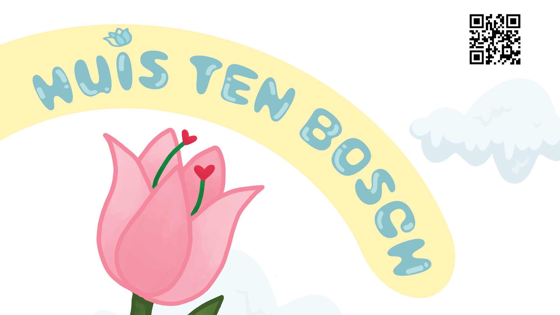
Claudia Surrena: Minimal, image-led layout with a soft palette and generous whitespace, pairing a strong headline system with a disciplined multi-column grid for body copy.